Overview
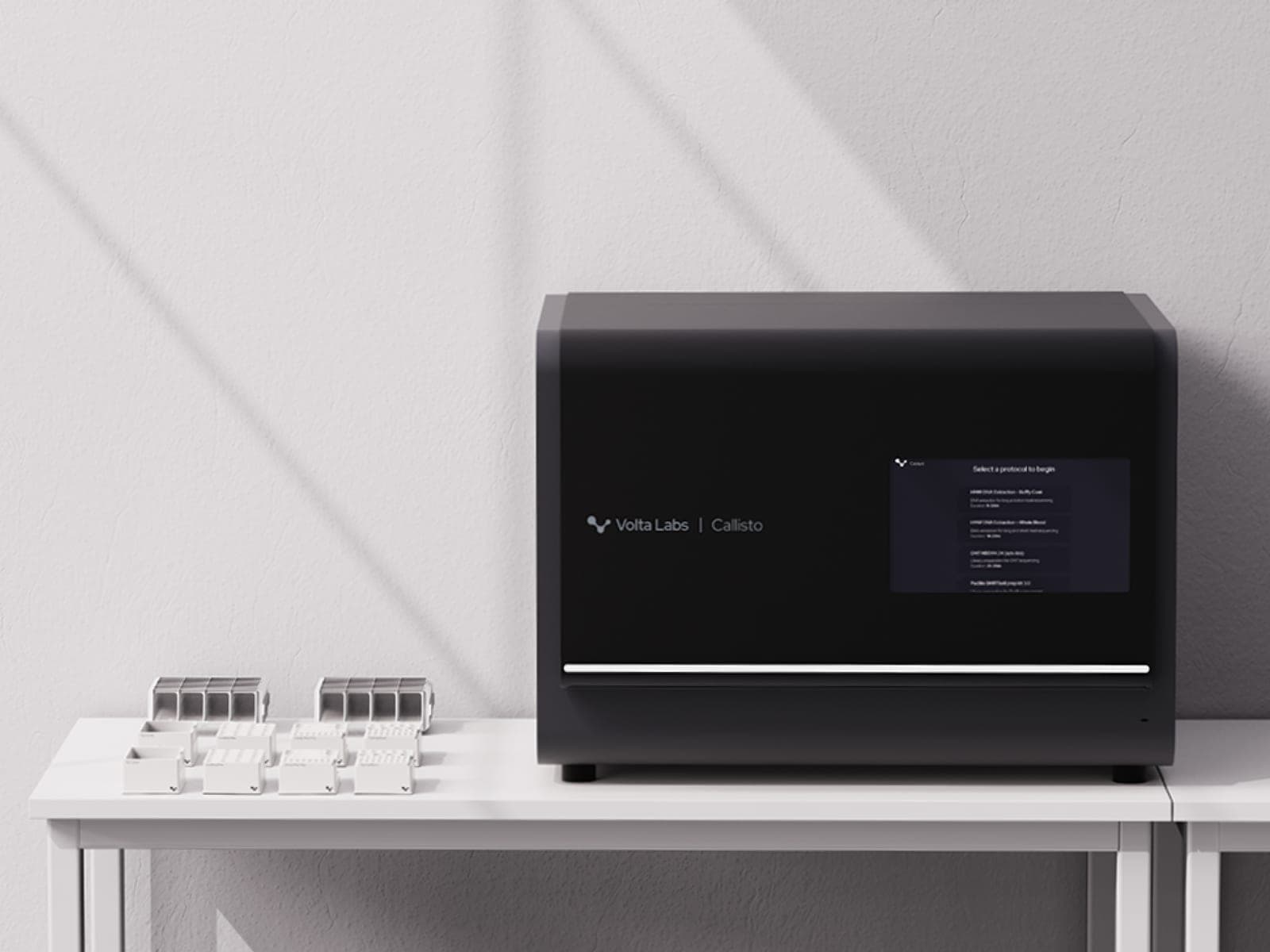
DNA isolation is a critical first step across biomedical research, diagnostics, and drug development, yet remains a surprisingly labor-intensive and error-prone bottleneck with little meaningful innovation in decades. Volta Labs’ Callisto modernizes DNA isolation with a precise, automated benchtop workflow that improves speed, consistency, and reproducibility while freeing scientists to focus on higher-value research.
Spatial Dynamics brought Callisto from early research through production, shaping both the product experience and the physical instrument. I led the design effort across research, product strategy, usability, interface architecture, visual design, and the enclosure and interaction mechanisms, working closely with my co-founders, who led mechanical engineering and DFM.
Three key challenges we faced:
- A 40-step workflow in which every step had to happen in the right sequence and under the right conditions.
- A fixed internal architecture that forced ergonomics, access, and serviceability to adapt around immovable components.
- Designing a system to accommodate a range of different biological inputs, workflow conditions, and throughput requirements, all while maintaining consistent performance.
Pain points
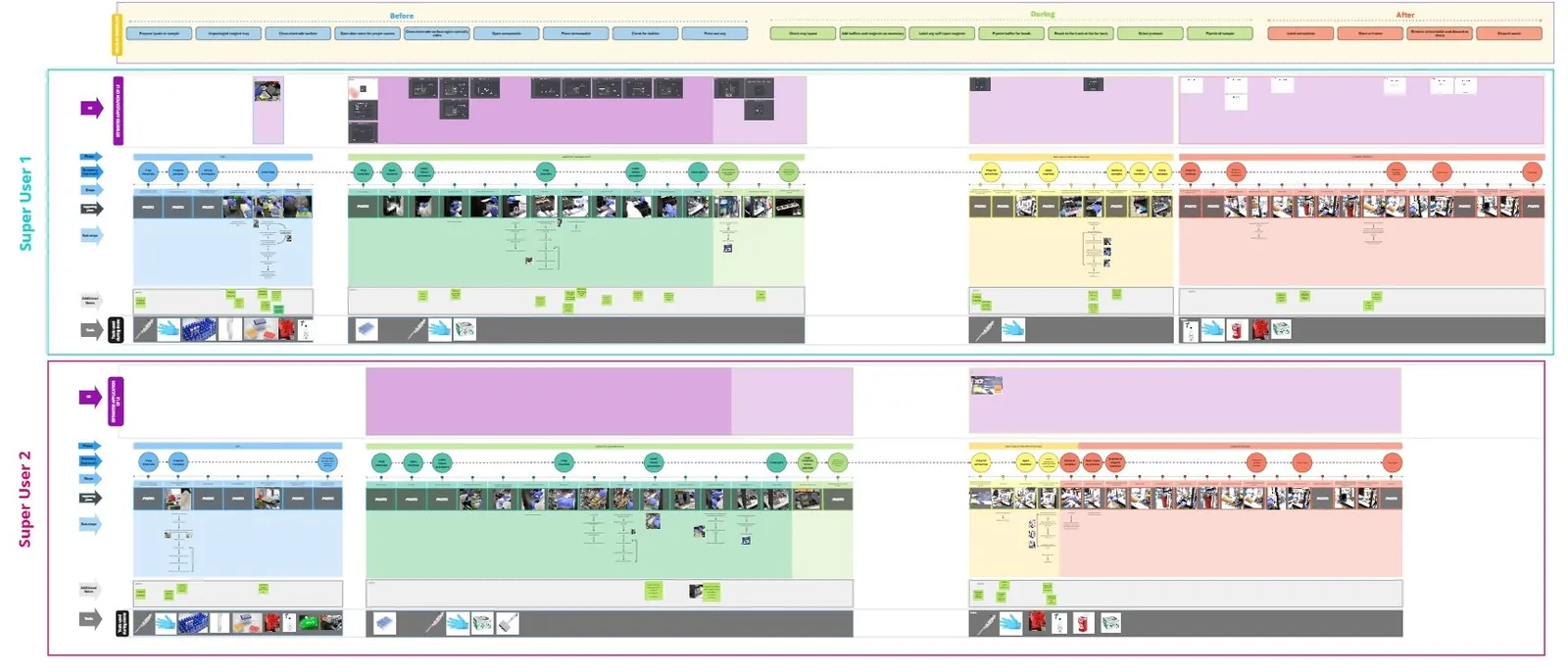
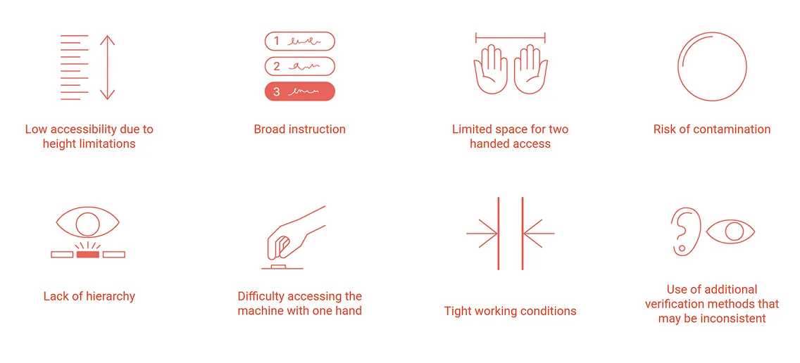
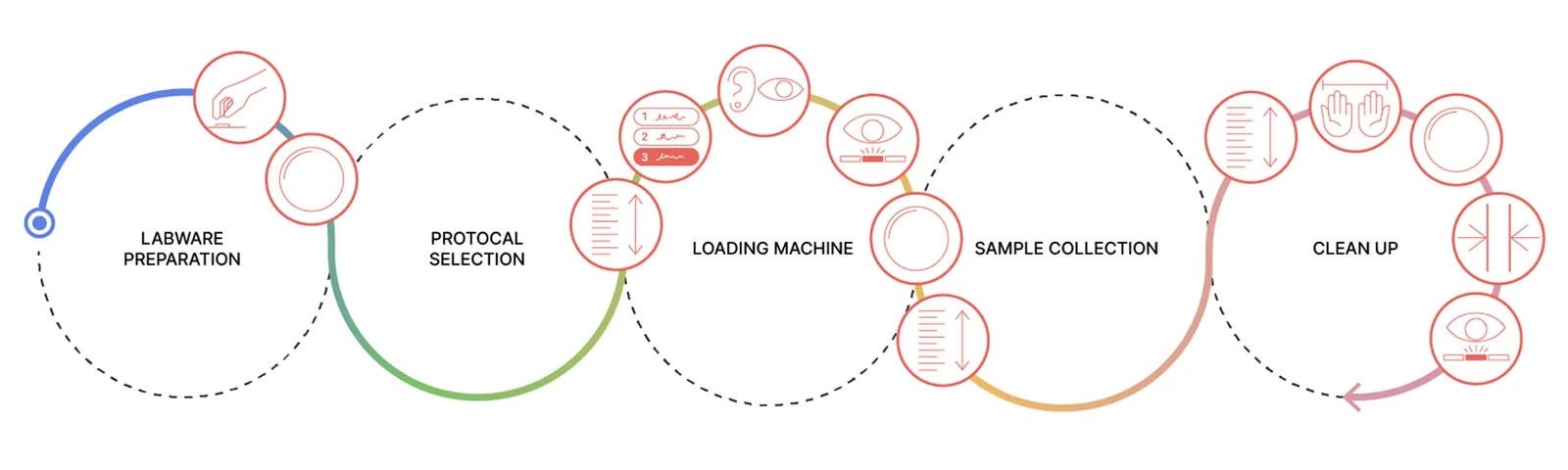
We interviewed wet lab scientists and closely analyzed their DNA isolation workflows, documenting key use cases and pain points. By mapping the journeys of several superusers, we identified eight major pain points that revolved around sample loading and cleanup. These findings made it clear that the door and interior workspace should become the primary focus of the design effort.
Design principles
From mapping the current experience, we then defined the design principles to get someone through a run correctly the first time.
Simplify decisions made by the user while providing enough information and clarification for the user to set up properly.
Clear, consistent communication for accurate first runs to build trust in the machine and in their ability to use it.
Strong branded experience elevates the user's interaction with the machine.
Design strategies
Here are the strategies we came up with to resolve the pain points.
Use of color to indicate action. Guide the user to a specific section of the machine or have colors help show how to appropriately finish a step.
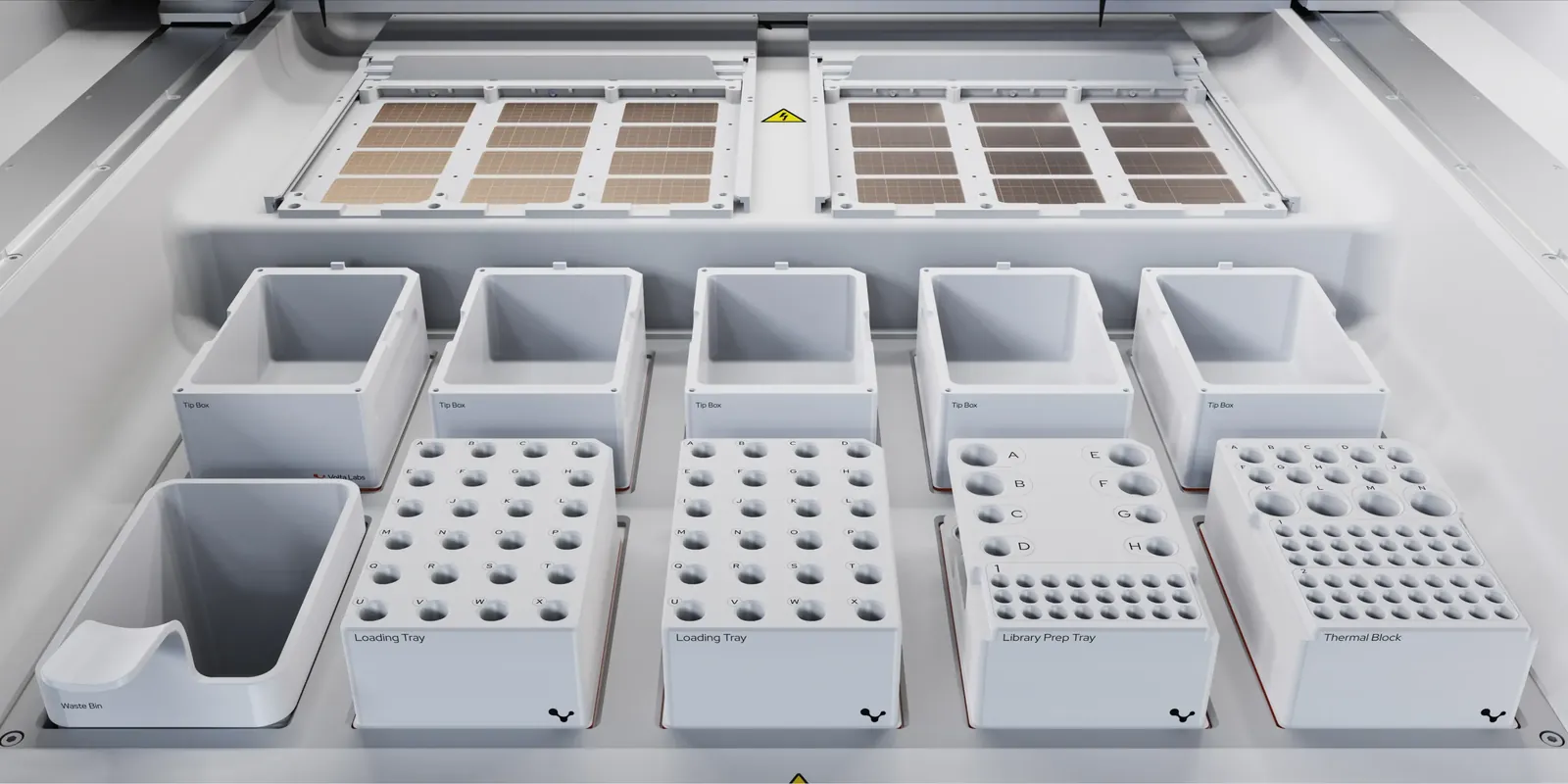
Smooth surfaces and single color for deck for ease of cleaning and to provide contrast against equipment and any other objects.
Screen must always be accessible and adjusted for different heights of technicians and when they are in different depths in the machine.
To build trust in the machine, the first test runs are the most crucial.
Technical constraints
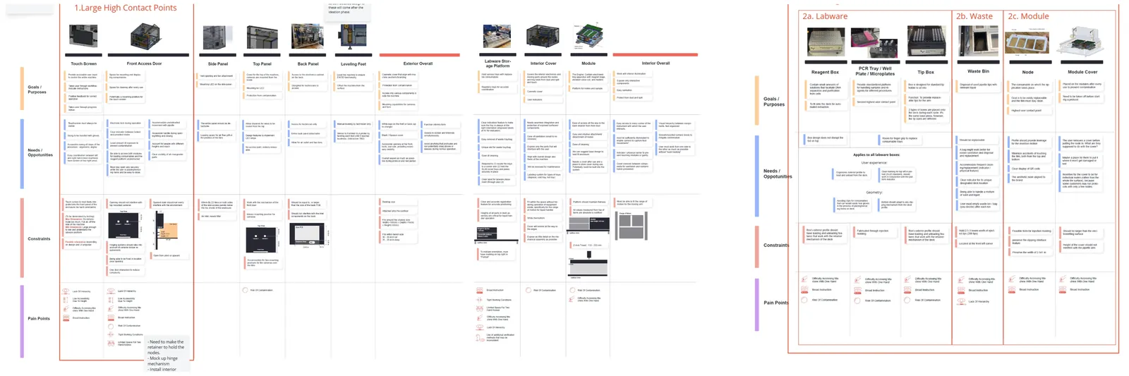
We mapped every component along with its purpose, needs and opportunities, constraints, and the pain points to resolve. This became the shared language with Volta's engineers.
The door
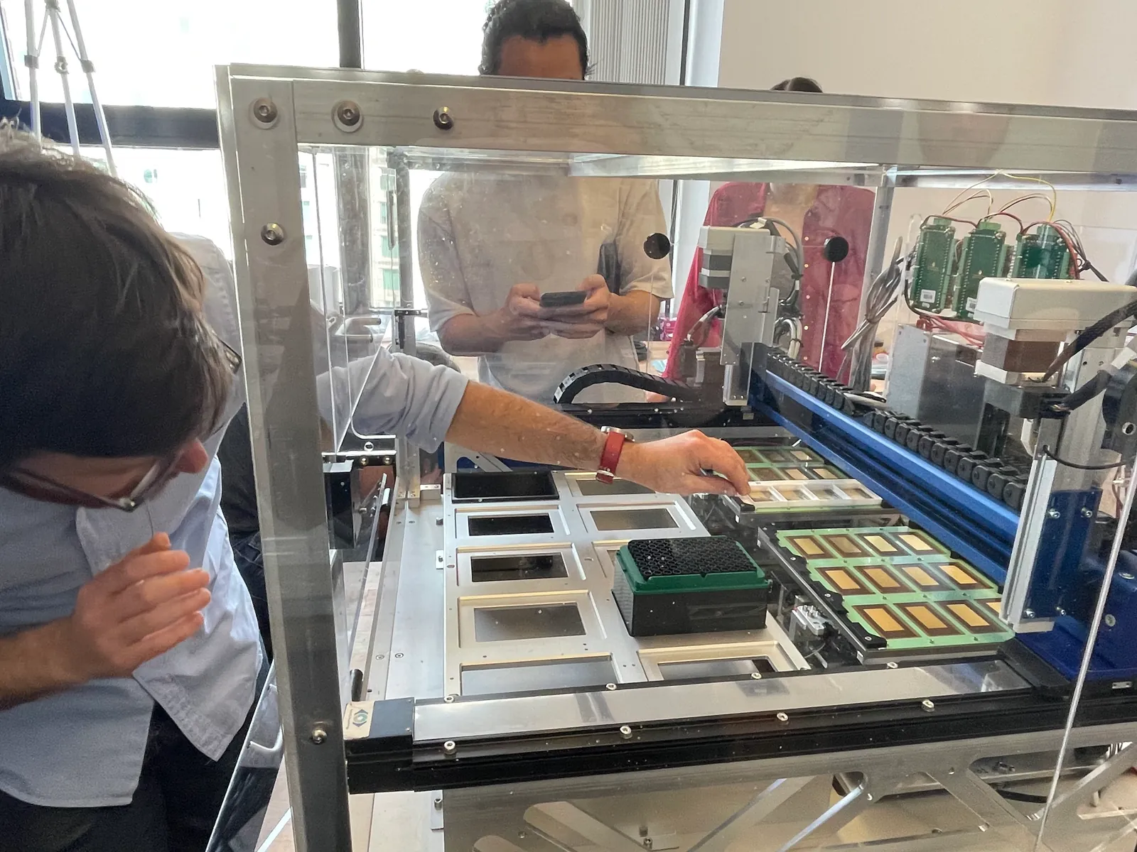
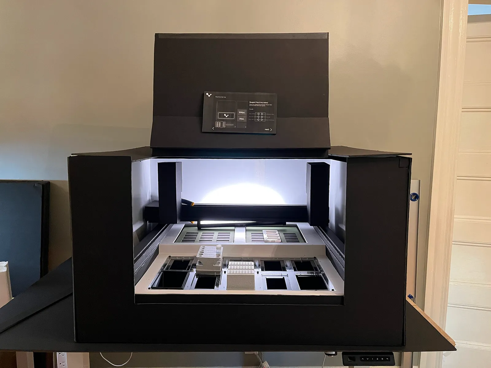
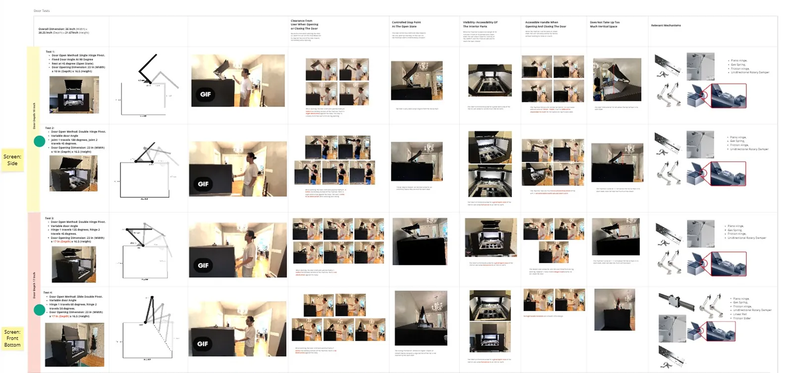
The door is one of the biggest interaction points in this experience, so we did a lot of brainstorming on how to make it comfortable and easy. We built a foam core and 3D printed prototype and brought it into the lab for the scientists to test.
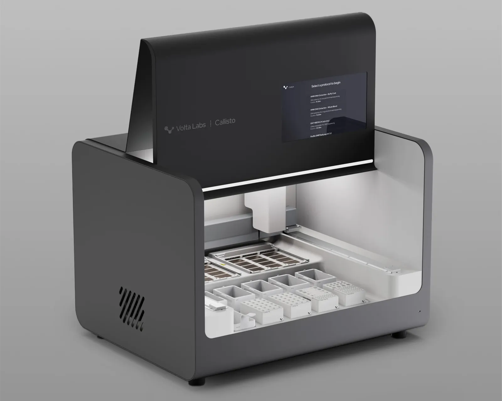
The folding door won because when any of the normal hinge doors opened, the handle ended up so high people had to reach to close it, and some couldn't reach it at all.
The screen
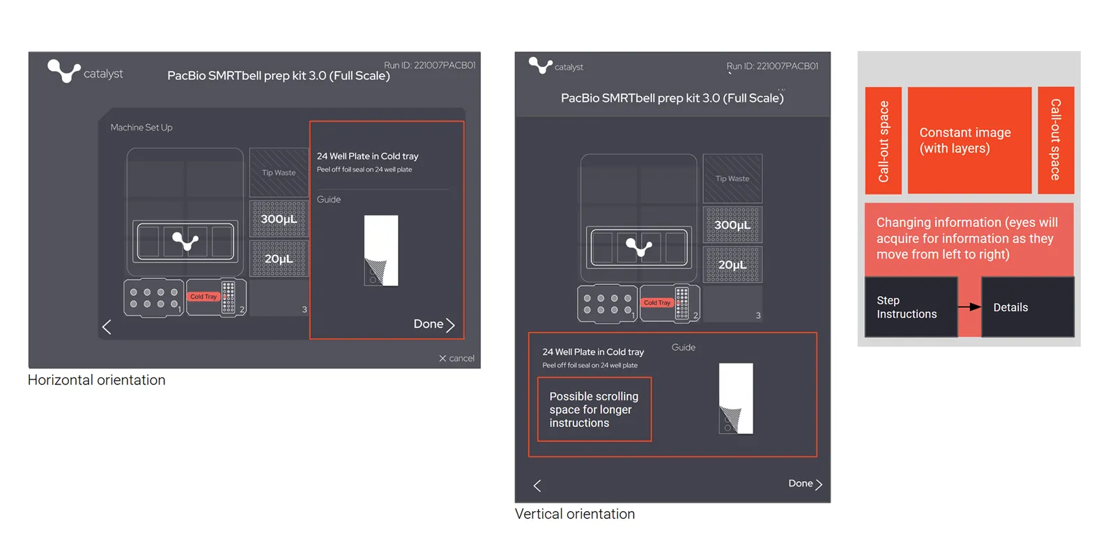
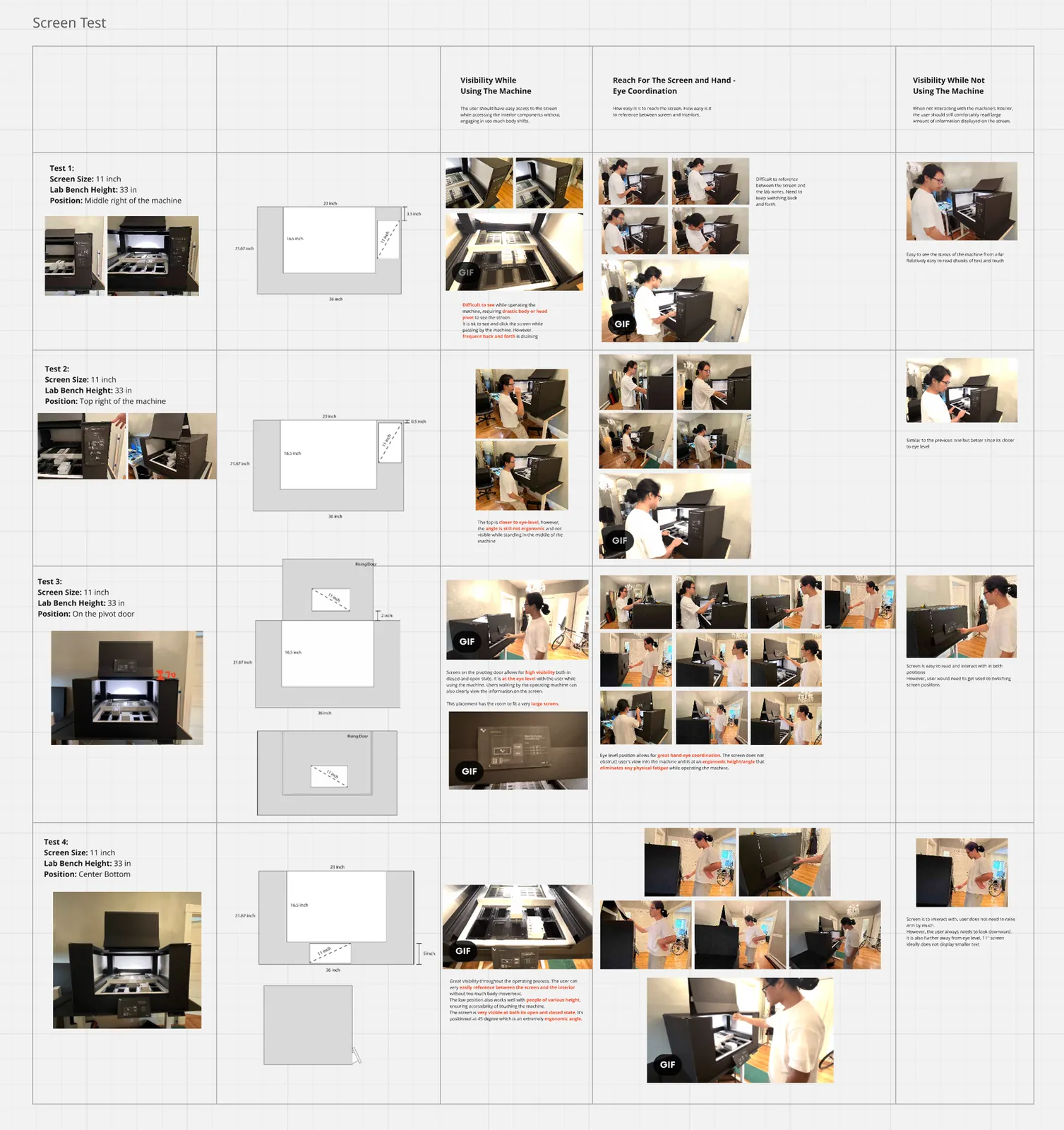
The screen was the other major component, and its location and orientation drove how the rest of the machine was designed. We prototyped different orientations and sizes since that changed how information could be displayed.
Horizontal on the door won. The machine was already at the max depth of a lab bench, so the screen couldn't extend out forward anywhere. Horizontal also sat at a comfortable viewing height across a range of people, and gave us room for the diagram showing where everything goes in the bed.
The design
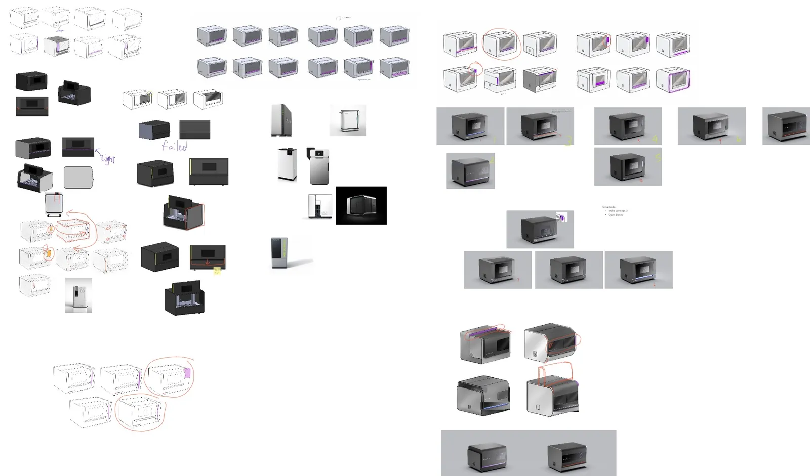
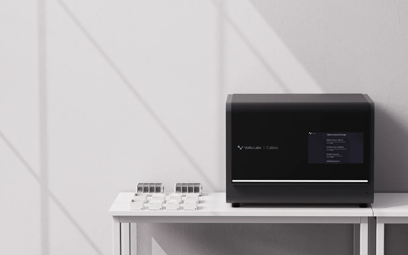
Once the structure decisions were nailed down we moved into the physical design. The CEO initially wanted a mysterious black box, but once we started creating concepts, he leaned more towards the friendlier looking ones. The final design sits between mysterious, high tech, and friendly.

DFM
Since our engineers were involved from the beginning of the process, we understood the technical gives and takes behind most decisions, so the concepts we presented to Volta were all very buildable, and there wasn't much pushback in the direction we landed on.
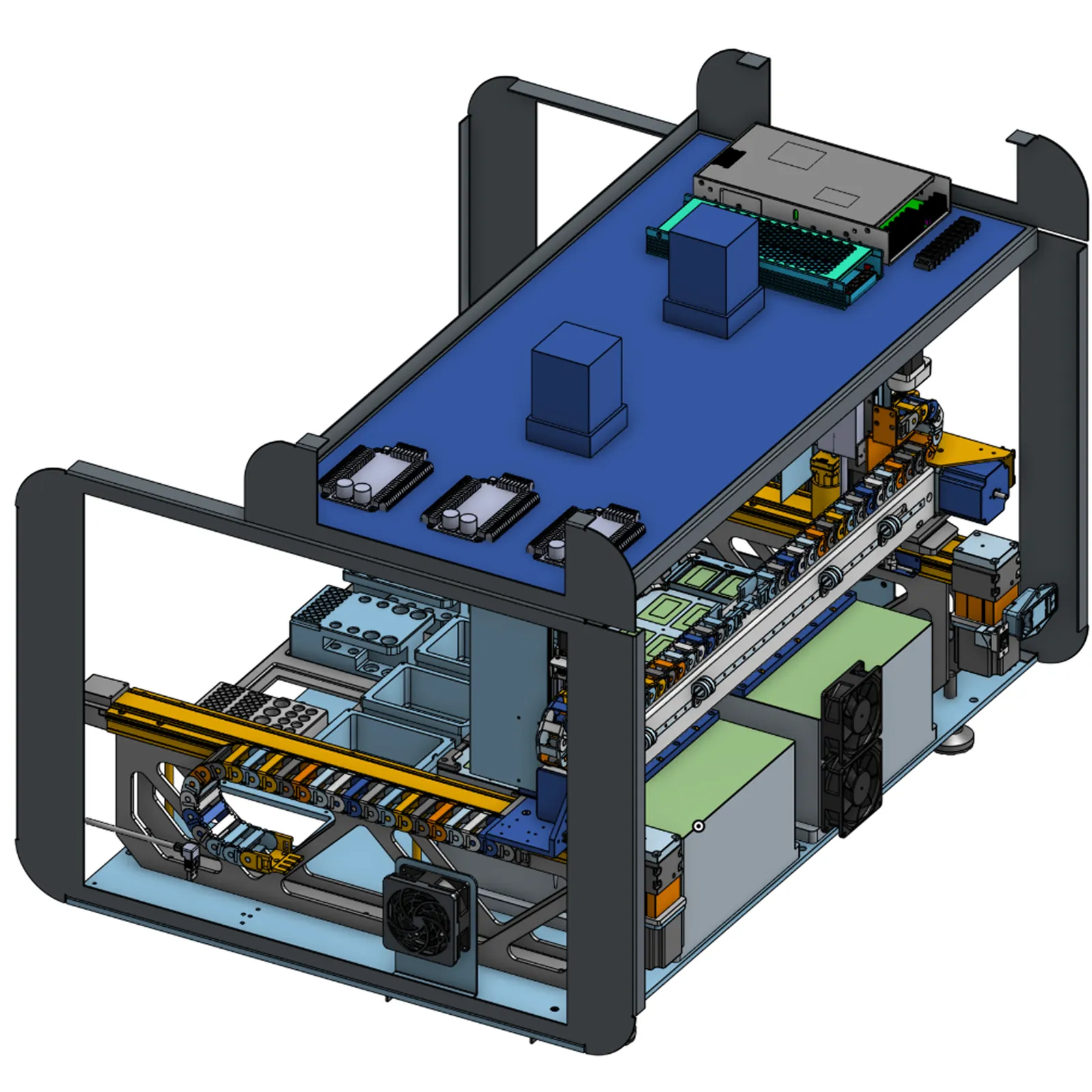
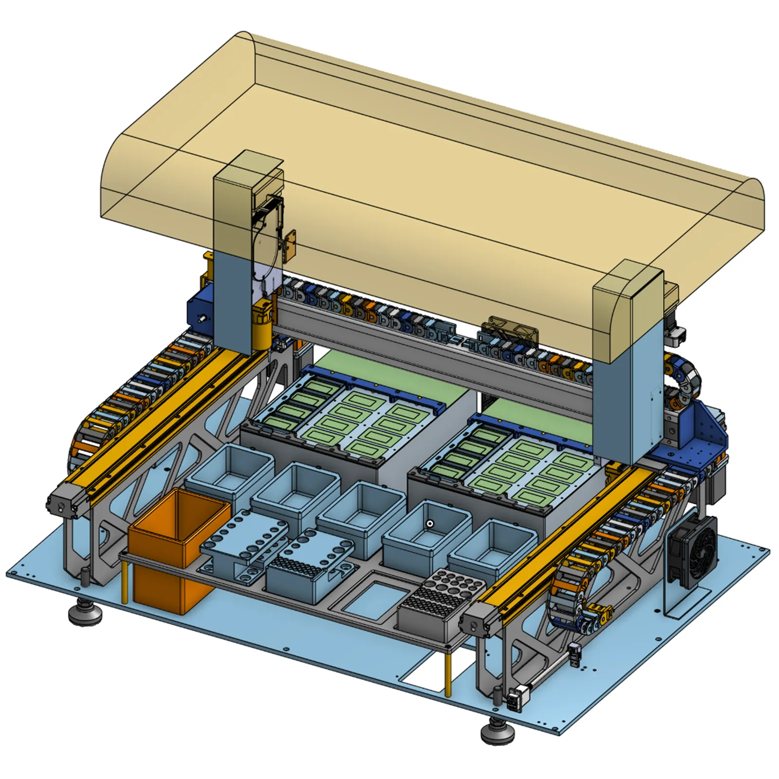
The harder problems were weight, and how the sheet metal panels came together. We had to be mindful of how much sheet metal was to be used for every decision, and also how the panels fastened.
Launch
Volta Labs Callisto launched in 2024 and has since received a Red Dot Design Award and an IDEA Silver Award.
Final reflections
A collection of thoughts and challenges throughout the project.
Volta pushed hard for a slanted top at one point of the project. Their engineers kept setting things like their coffee on the machine, and they were worried the top would turn into a storage shelf. Instead of arguing, we ran a round of slanted concepts, and everyone quickly realized a slanted roof was a bad idea. It wasted internal volume, it was very hard to make look good, and most labs don't allow food or drinks near the bench anyway.
Putting the screen on the door meant wiring electrical through a moving part, which added cost and complexity. The CEO backed it because he stressed usability first. The round after this version went a different direction, with a simpler door and a screen that wasn't fully integrated, so parts were easier to make and replace. For a startup trying to do the most with less, this makes sense. Usability and aesthetics had to be compromised a bit the next round.
The door came out much heavier than we estimated. We planned for the hydraulics to do the lifting and that part worked, but closing it was the problem. There was only a ledge to grab, and on a heavy door it wasn't enough. It looked good, but it was harder to use than it should have been. The opening experience was great, but the closing was a miss this version.