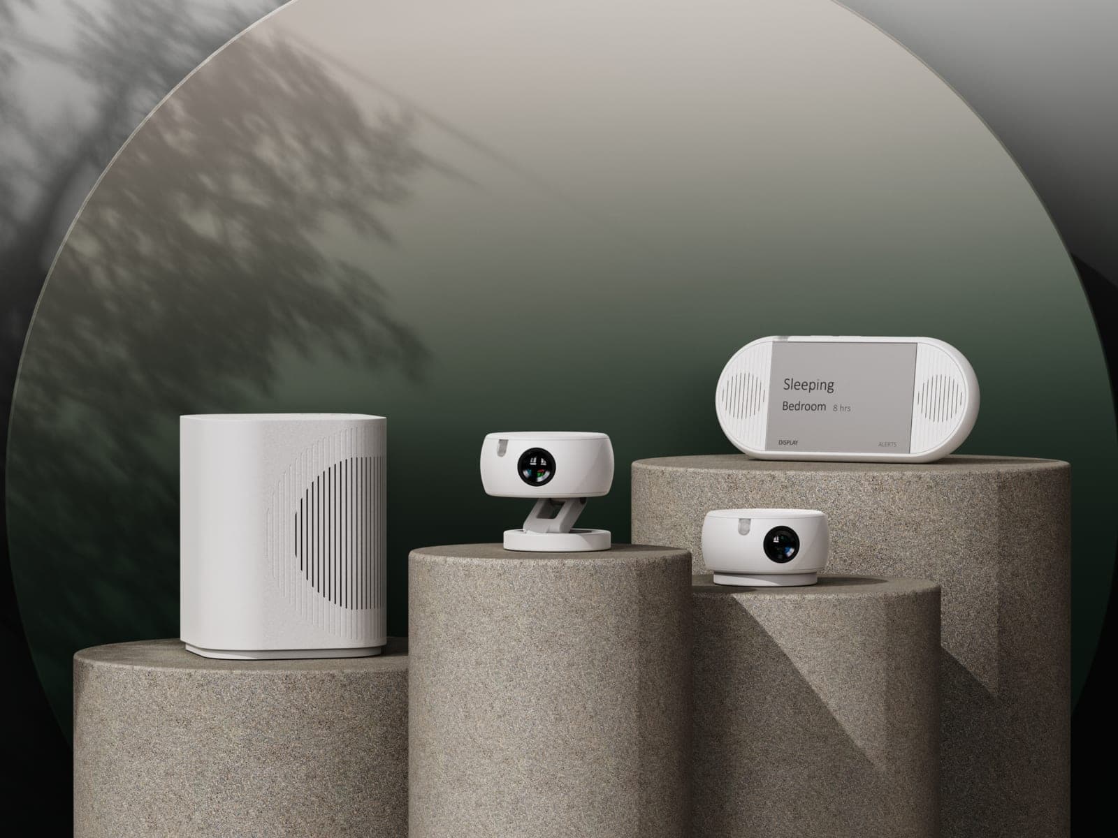
Overview
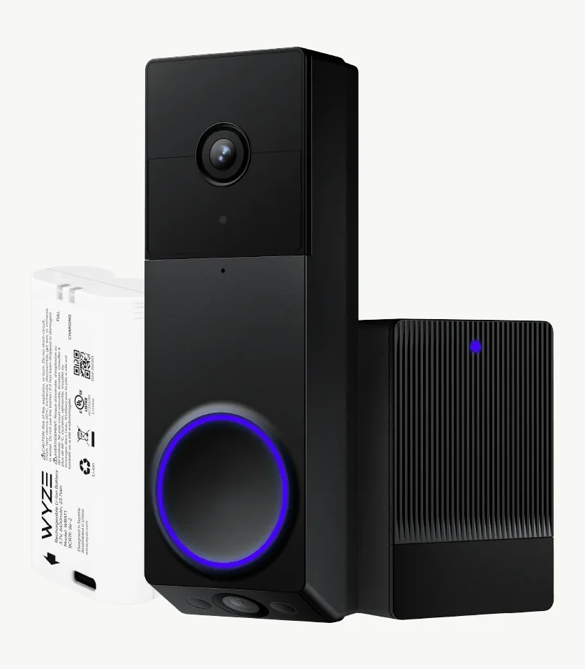
WYZE built its smart home business around delivering capable hardware at accessible prices, but its products had also developed a reputation for looking as inexpensive as they were. For the Duo Cam Doorbell and Chime, Spatial Dynamics was brought in to refine and mature the design while preserving the brand's affordability. I led the research, strategy, and design, creating a more elevated visual language that felt premium on the front door.
Three things made this difficult.
- The reputation. Reviewers kept saying WYZE products looked as cheap as they cost.
- The location. A doorbell sits on the most visible spot of someone's house.
- The price. The budget couldn't move. Premium look, WYZE price.
The false start
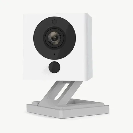
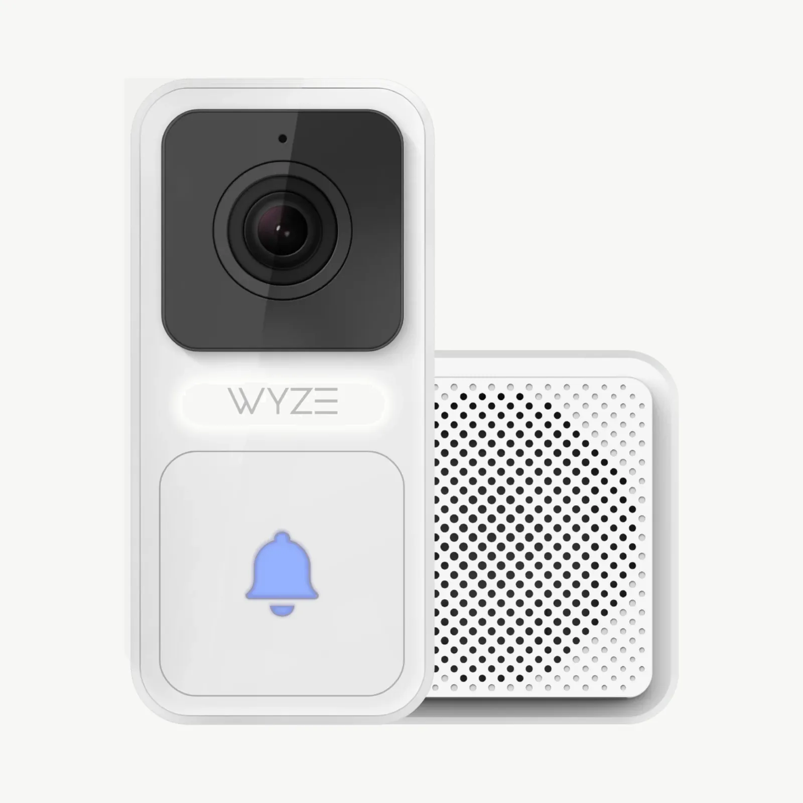
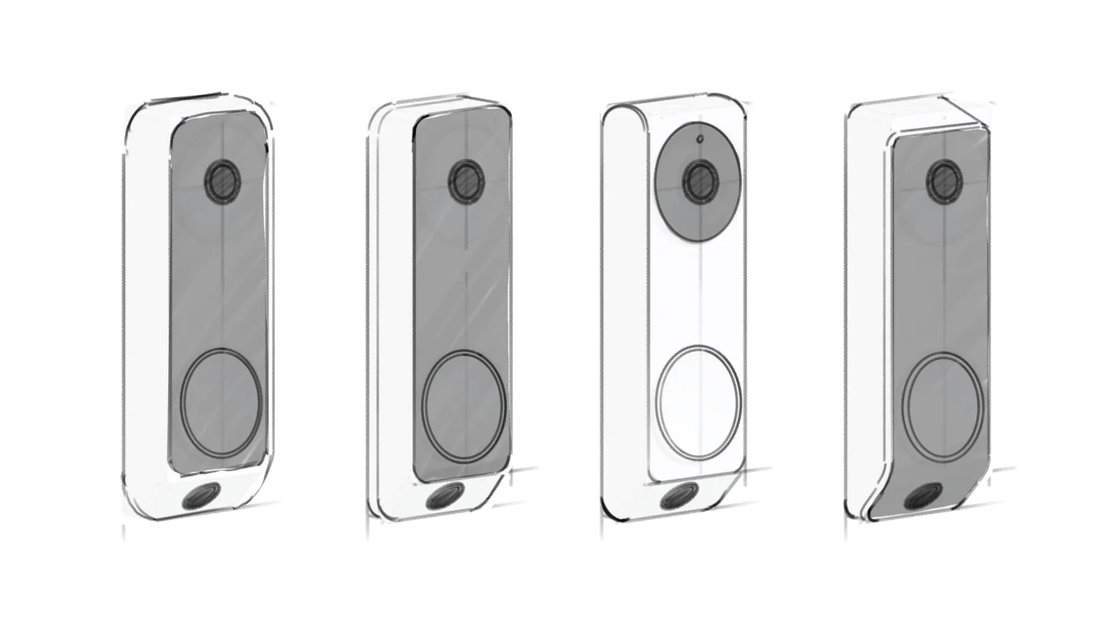
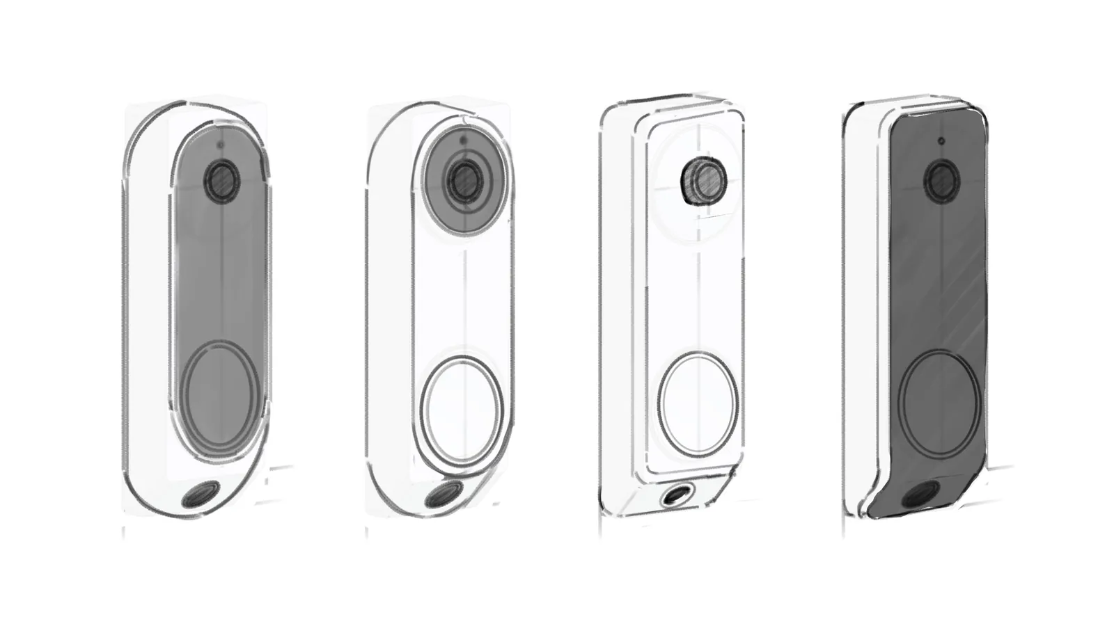
At the time, WYZE only had single camera doorbells. They knew the duo cam doorbell and duo security camera was next, but weren't sure what visual direction to take it in.
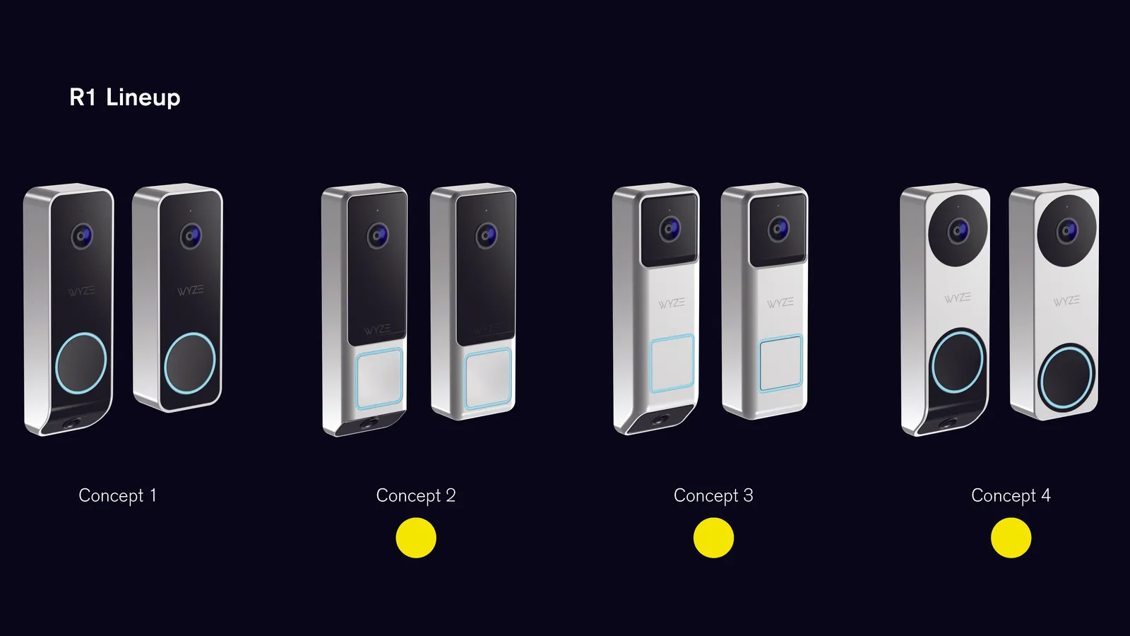
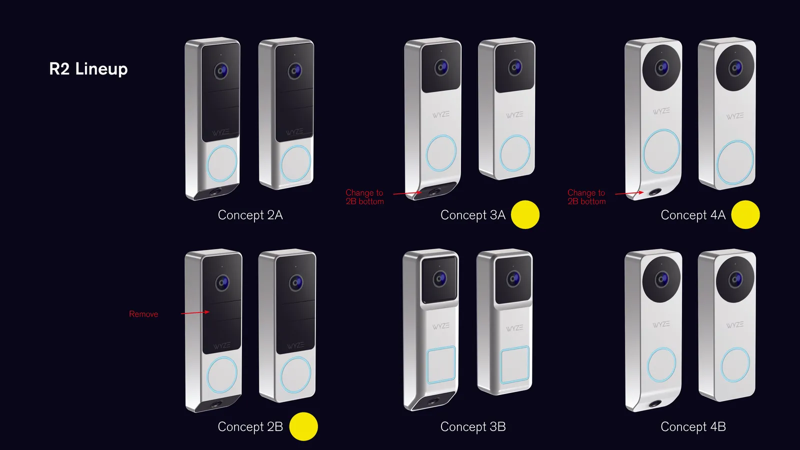
Their initial ask was to just create some concepts of the doorbell with no initial research, so we did that for a few rounds, and none of them were working. They went to their manufacturer for some free designs, and they didn't like those either.
In the meantime, they gained clarity in their product positioning and realized they wanted something more high end feeling to elevate the brand, and to design the duo cam first. So we asked them to give us a little more time to do a proper round of design, starting from market research.
The research
There was no budget for user studies, so we combed through published reviews of WYZE's doorbell, their chime, and every major competitor.
The reviews were blunt. The Verge said it looked as cheap as its price tag. Wired called it a chunky candybar. The only compliment was that it felt sturdy.
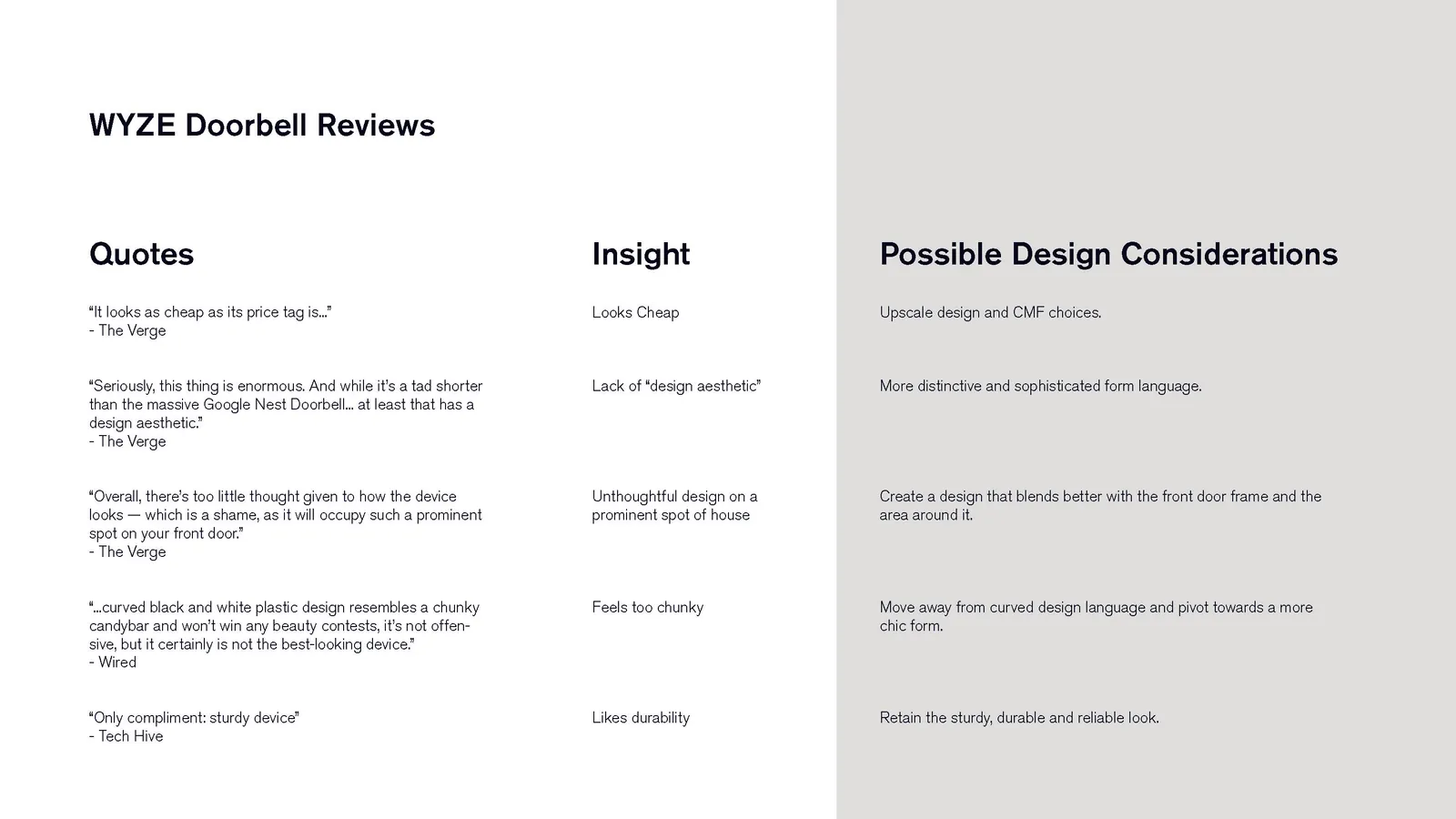
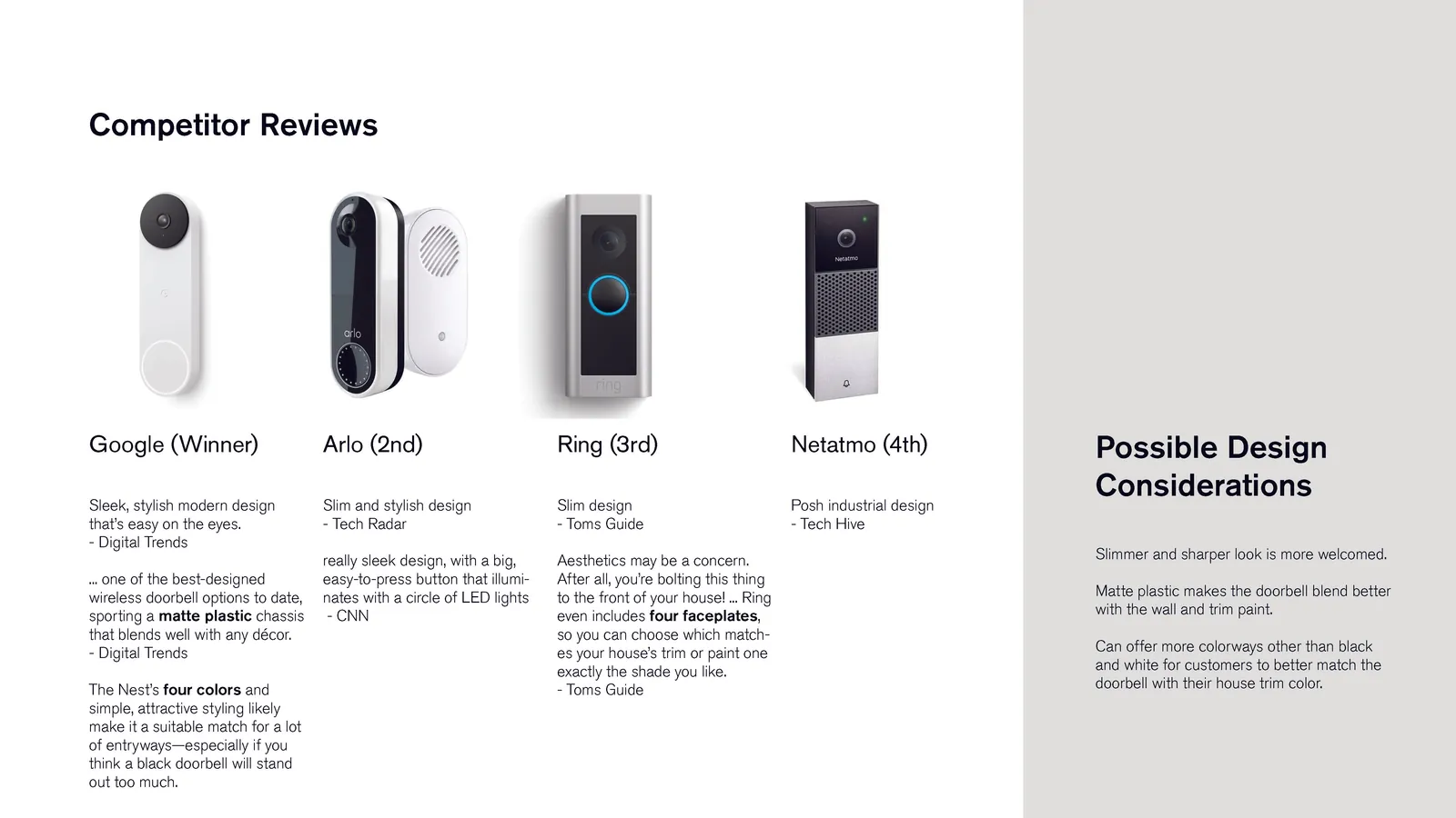
Three findings drove the design.
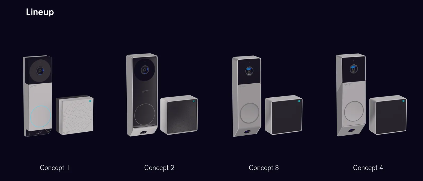
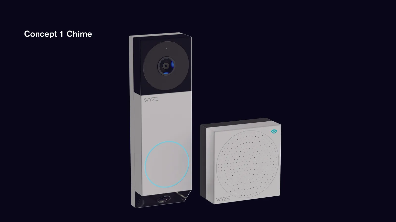
Reviewers loved how seamlessly the camera and chime paired, so the doorbell and chime should look like an inseparable pair.
The market rewarded slim, sharp, and matte. Google won reviews with a matte chassis that blends into any wall.
People liked how sturdy it was.
The design
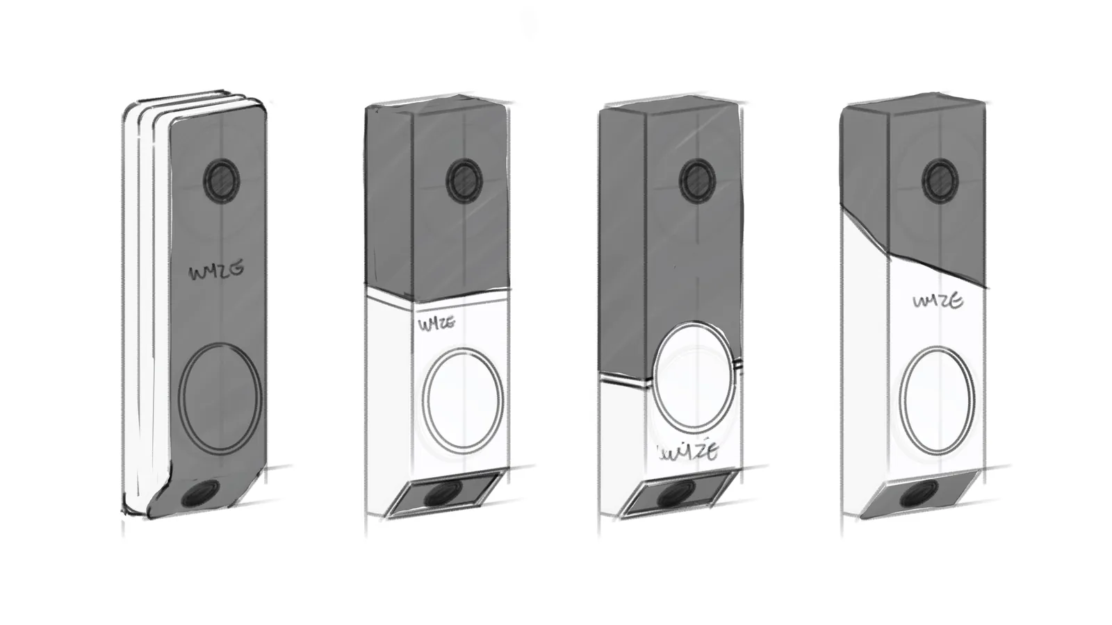
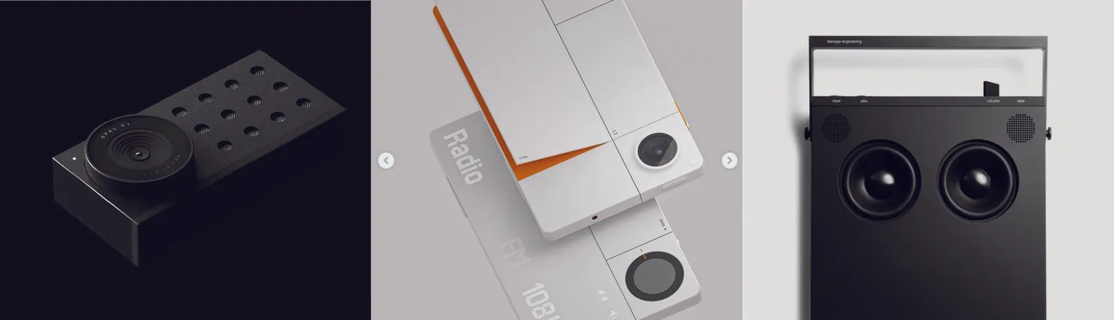
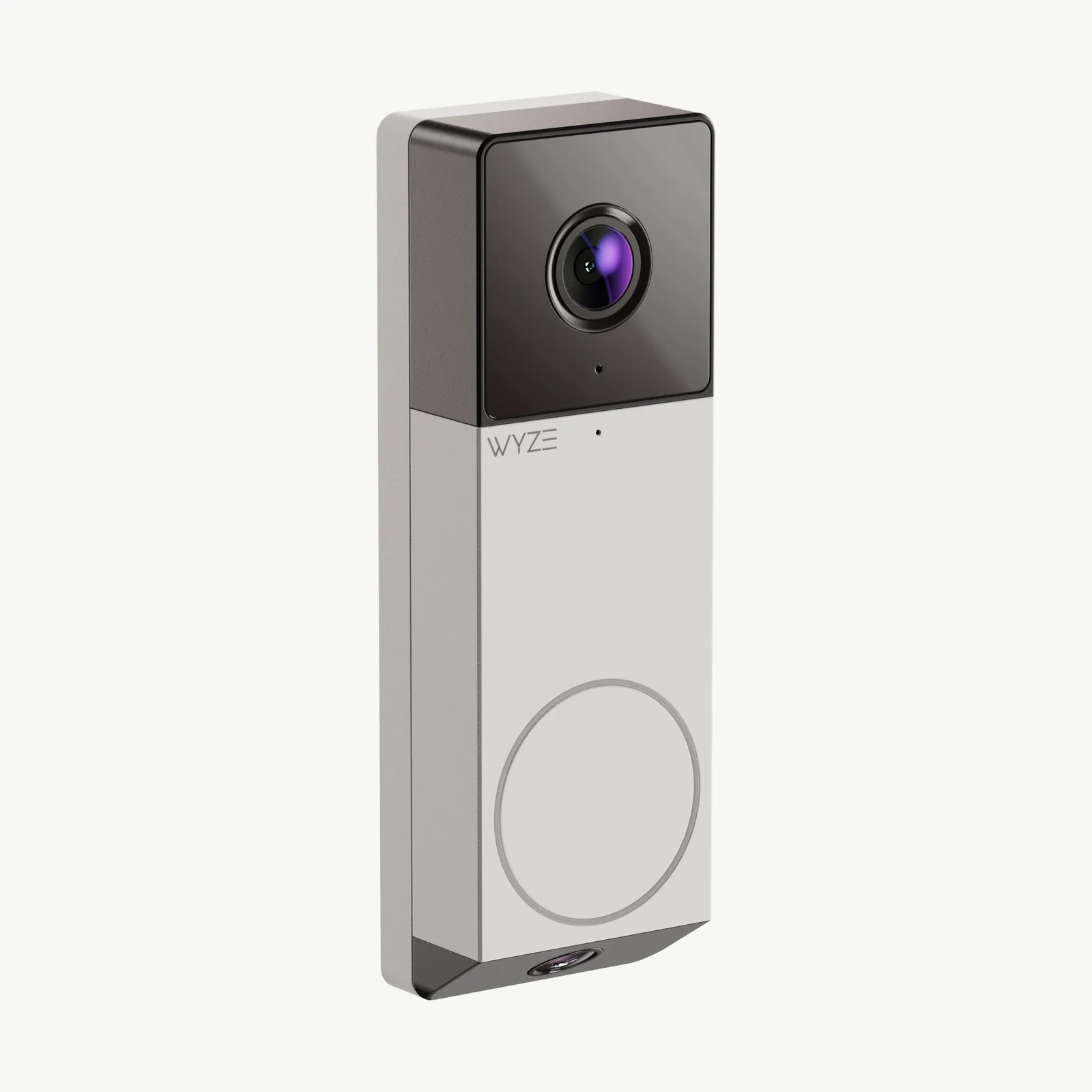
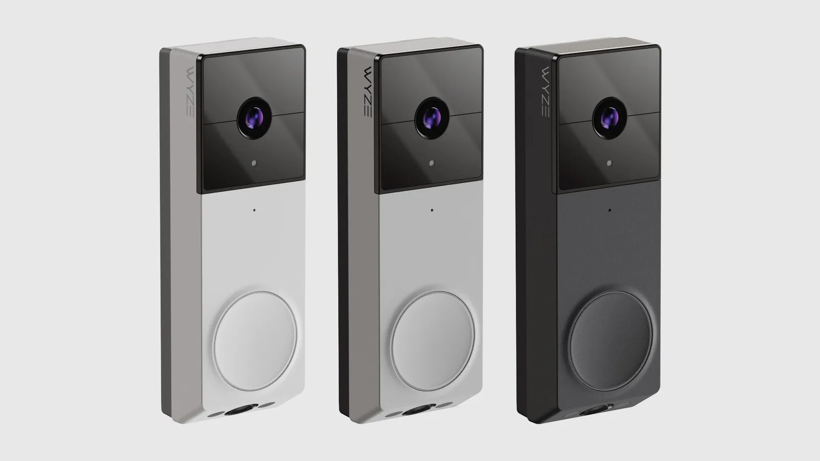
After gaining clarity on what was working and what wasn't, we created a variety of mood boards and concepts, and managed to quickly find something they liked. We called the direction Precision: sharp geometry, honest materials, small deliberate details.
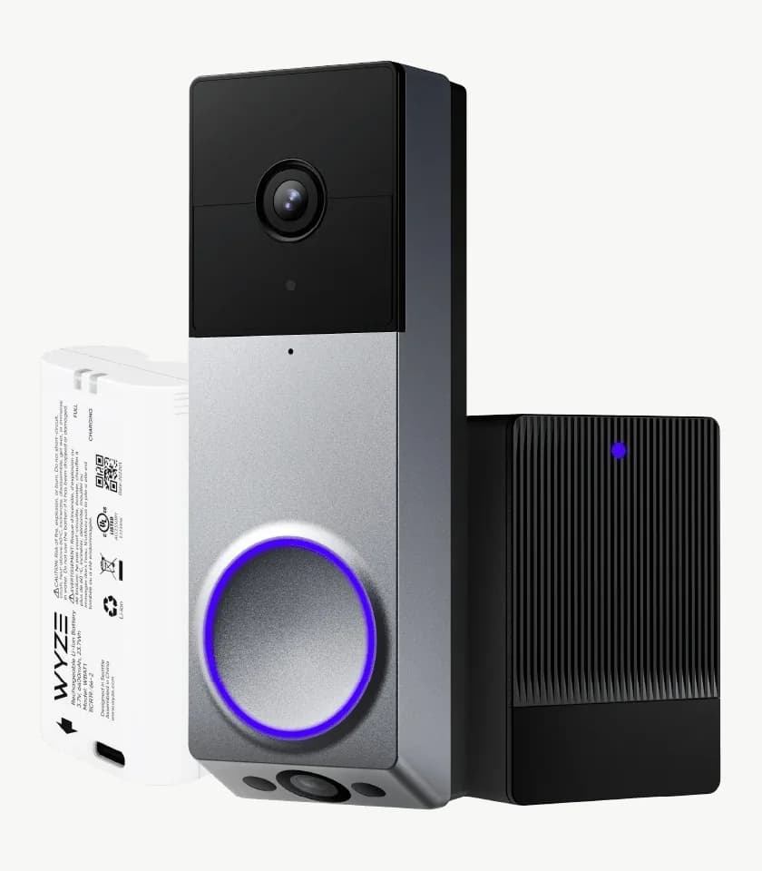
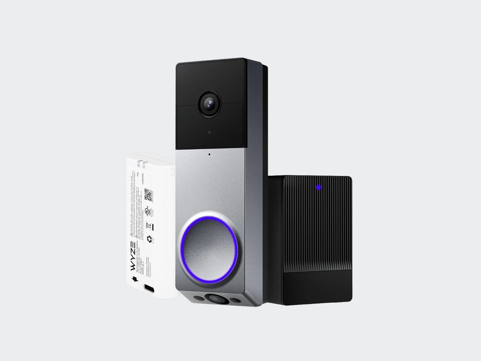
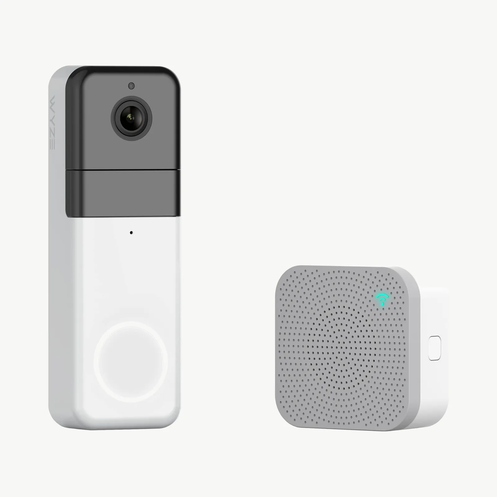
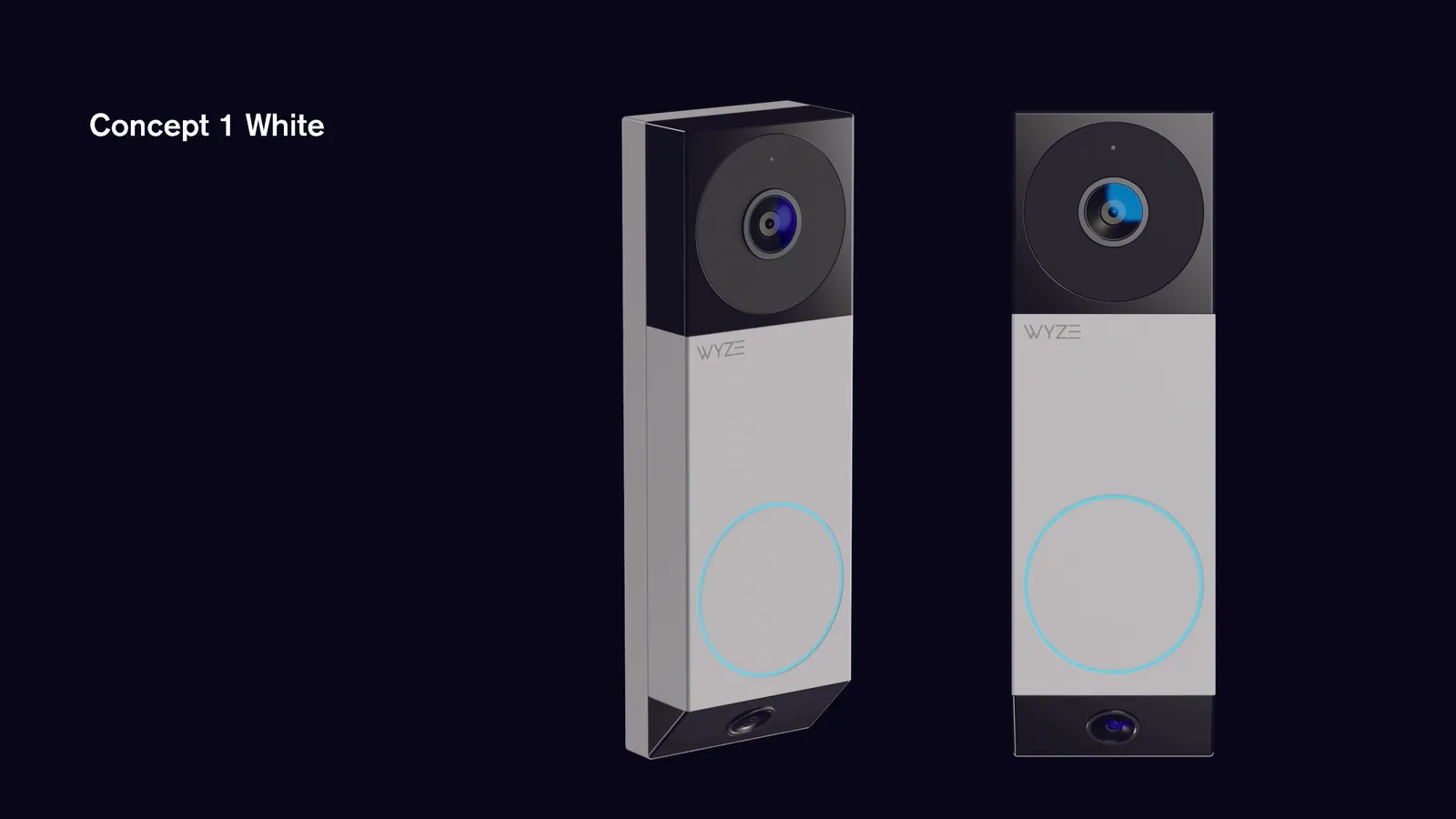
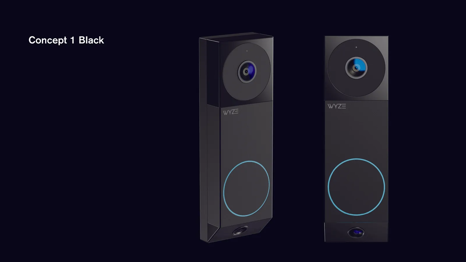
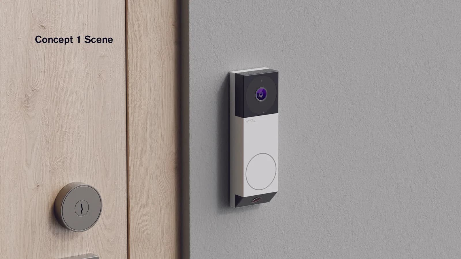
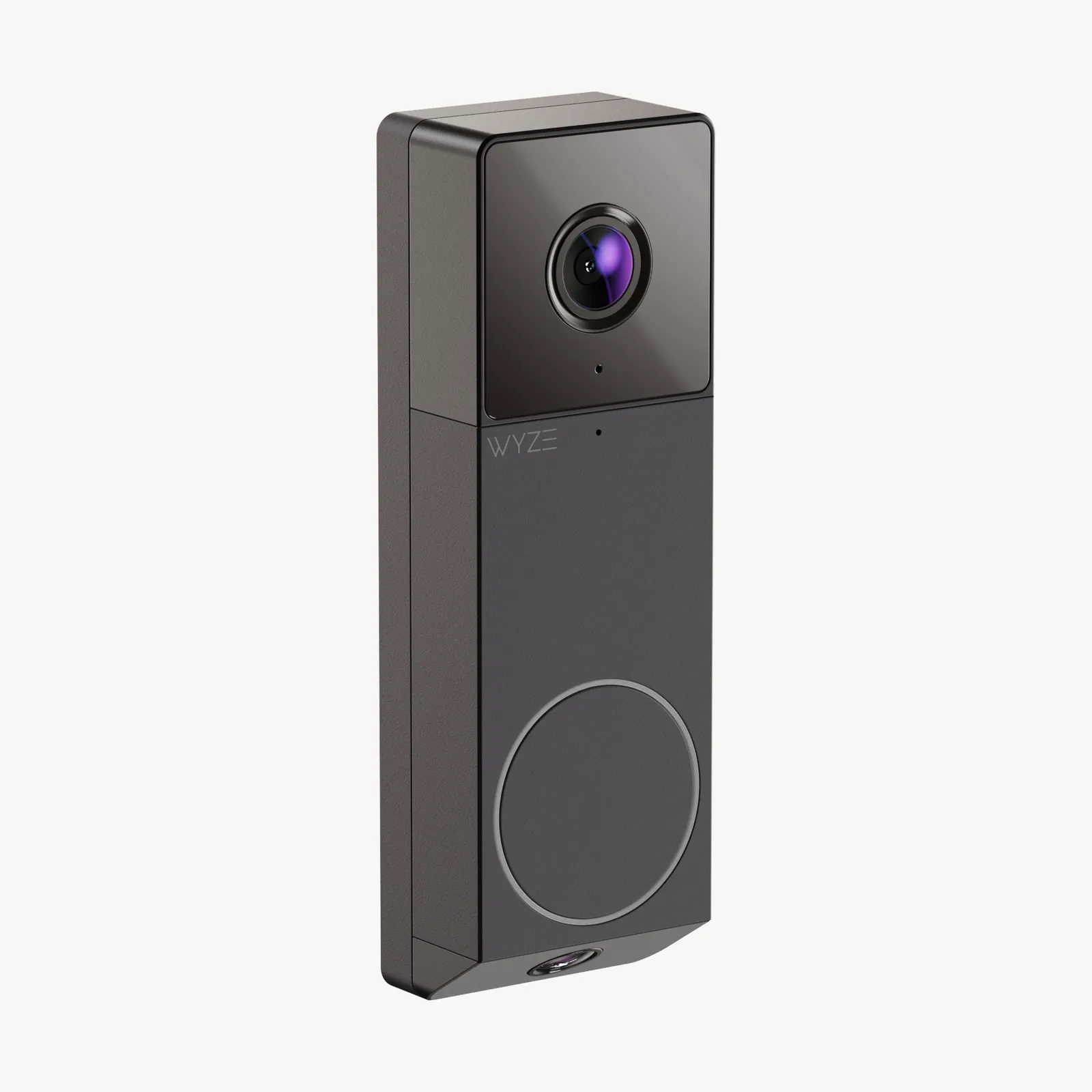
The form has two zones: a glossy camera block on top, and a matte body below with the button ring and logo. The angle at the bottom came from the second camera, which needed a specific downward angle to see packages at the doorstep.
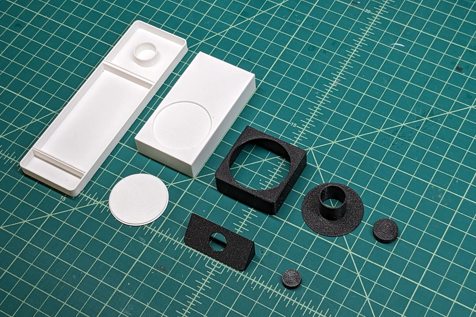
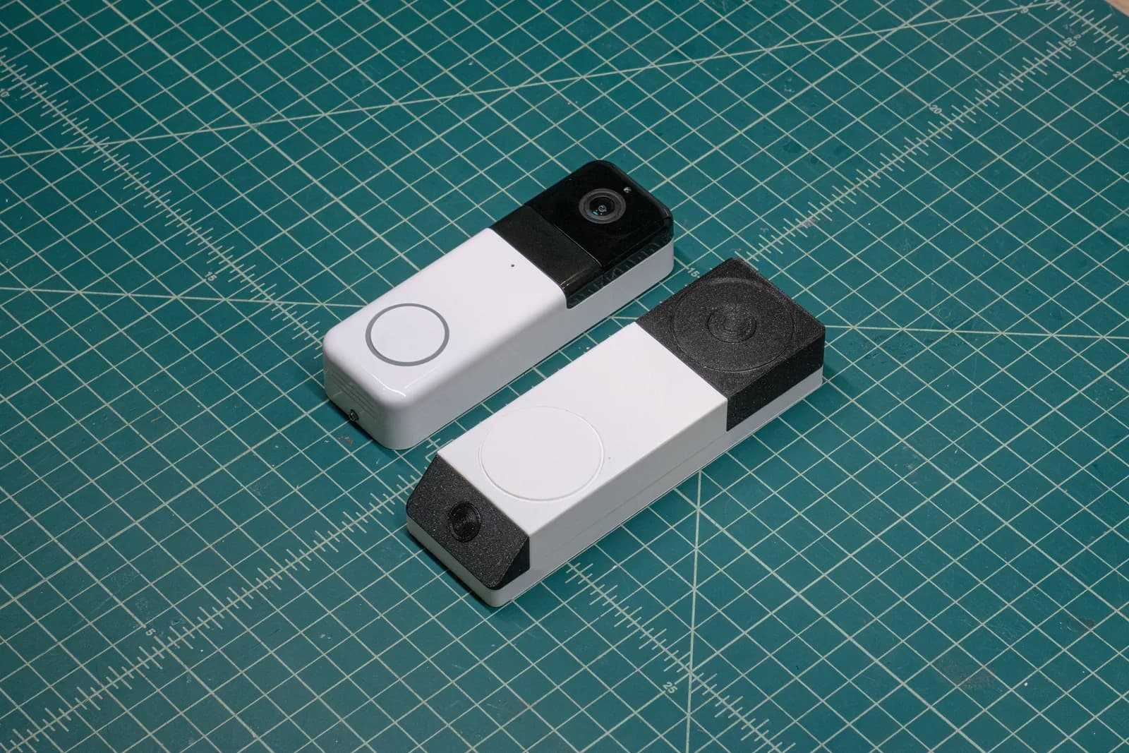
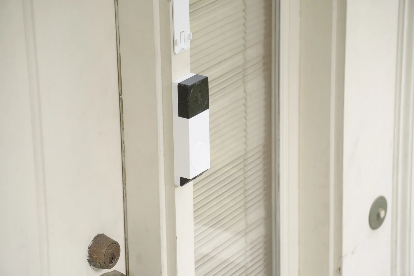
To check it in the real world, we 3D printed it and stuck it on an actual door frame.
Working with engineering
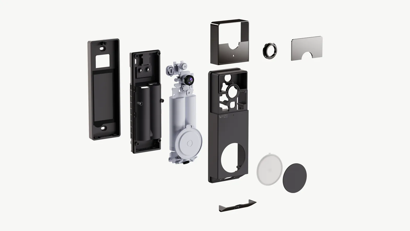
My co-founders led DFM with WYZE's engineers while I supported. The original design was really slim, but the battery and internals forced the housing thicker, and the slim look was gone.
Instead of accepting a brick on the wall, we pushed the added depth to the back and recessed the sides, so the front face reads as the whole product and the body has a slight floating effect. From straight on it still looks slim, but it's thick enough to contain the internals.
The final product
The doorbell shipped in black and silver, along with the chime designed to match.
When the reviews came out, they were the opposite of the old ones. Reviewers said it performs like the more premium cameras and doesn't cut corners, and described the design as hard-edged and industrial, which was exactly what we were going for.