Overview
As an occasional customer of Quest Diagnostics, I've noticed in recent years they have made some digital platform improvements. I believe there's still ample opportunity to enhance the patient experience. Routine medical tasks can be scary, or at the least annoying, so I wanted to find a way to help alleviate that stress. I gave myself the brief and a two week timeline: map the whole patient system, find where the anxiety lives, and redesign it end to end.
Three things made this project difficult:
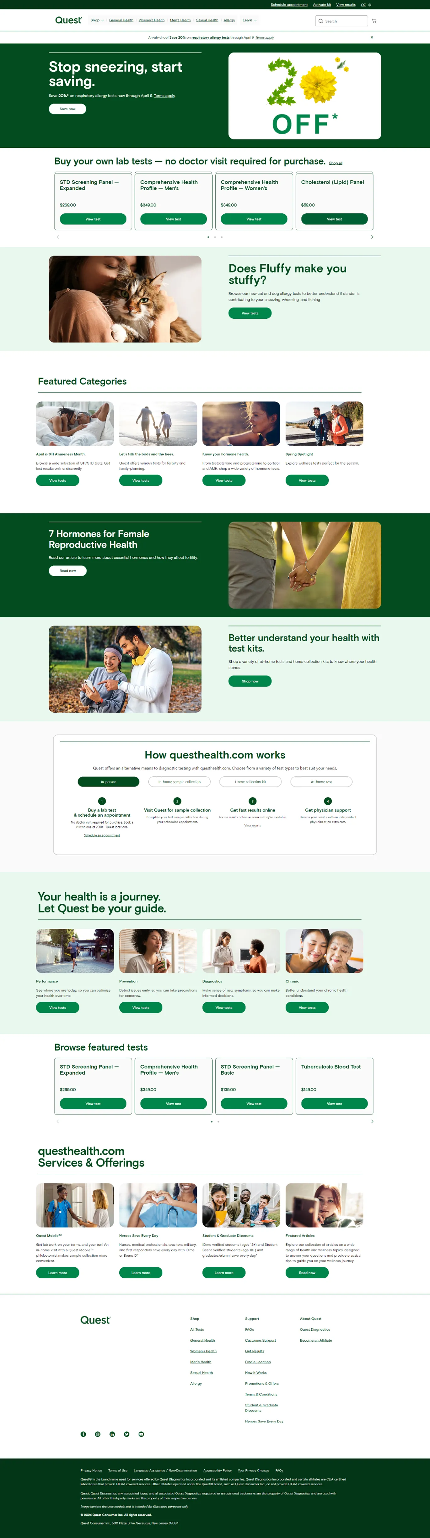
- Quest actually has two sides, the diagnostics portal and the Quest Health shop, and many do not know the shop even exists.
- Test results were often difficult to understand if you do not have a medical background, so patients wait for doctors to translate, and waiting is where the anxiety lives.
- The whole site feels old, which for a health company can read as untrustworthy.
Current site audit
As I evaluated the current site, I noticed several key issues:
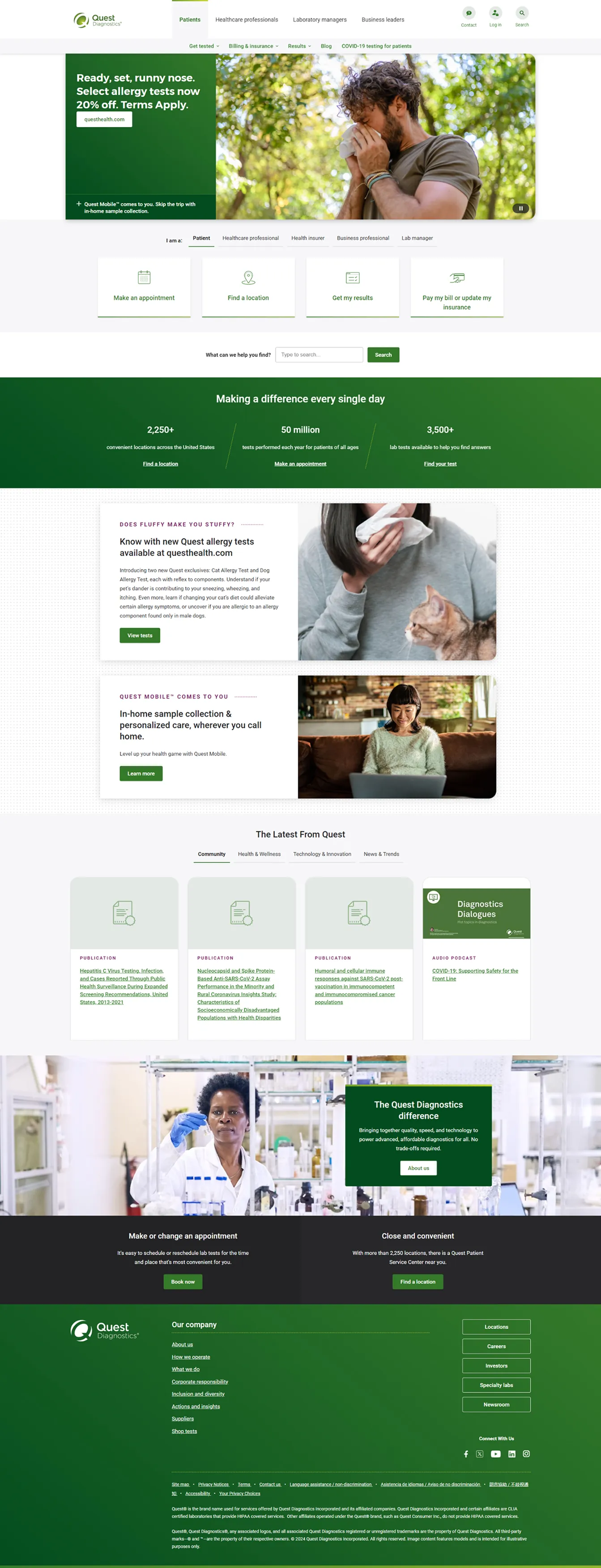
- Patients lack sufficient information about ordering tests independently, without a doctor, via Quest Health, a major revenue source for the company.
- Cluttered homepages feature repetitive calls to action, causing user confusion.
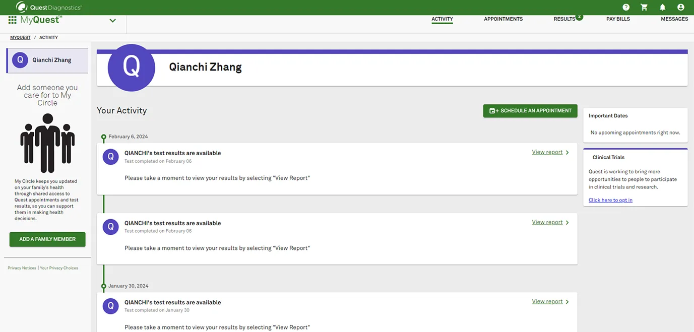
- The outdated aesthetics, particularly in the dashboard, fail to leave a positive impression, leaving users feeling disconnected.
With this many obvious issues at first glance, I knew there were bound to be more opportunities for improvement throughout the patient experience.
System architecture
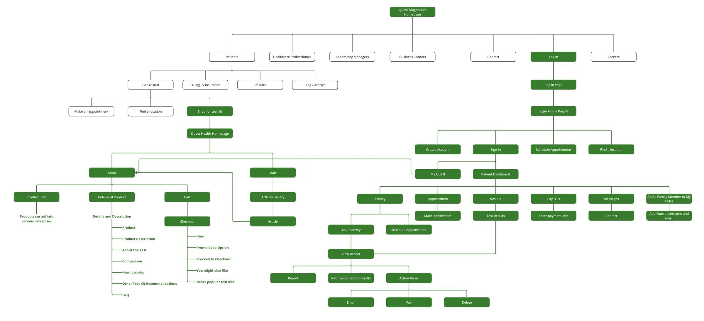
After mapping the entire patient-facing system, I discovered two key branches offered to patients. The first, Quest Diagnostics, provides access to the patient portal for viewing test results. The second, Quest Health, allows patients to order tests online and then visit a Quest Diagnostics lab for sample collection.
For this project, I chose to focus solely on the patient experience.
User journey and pain points
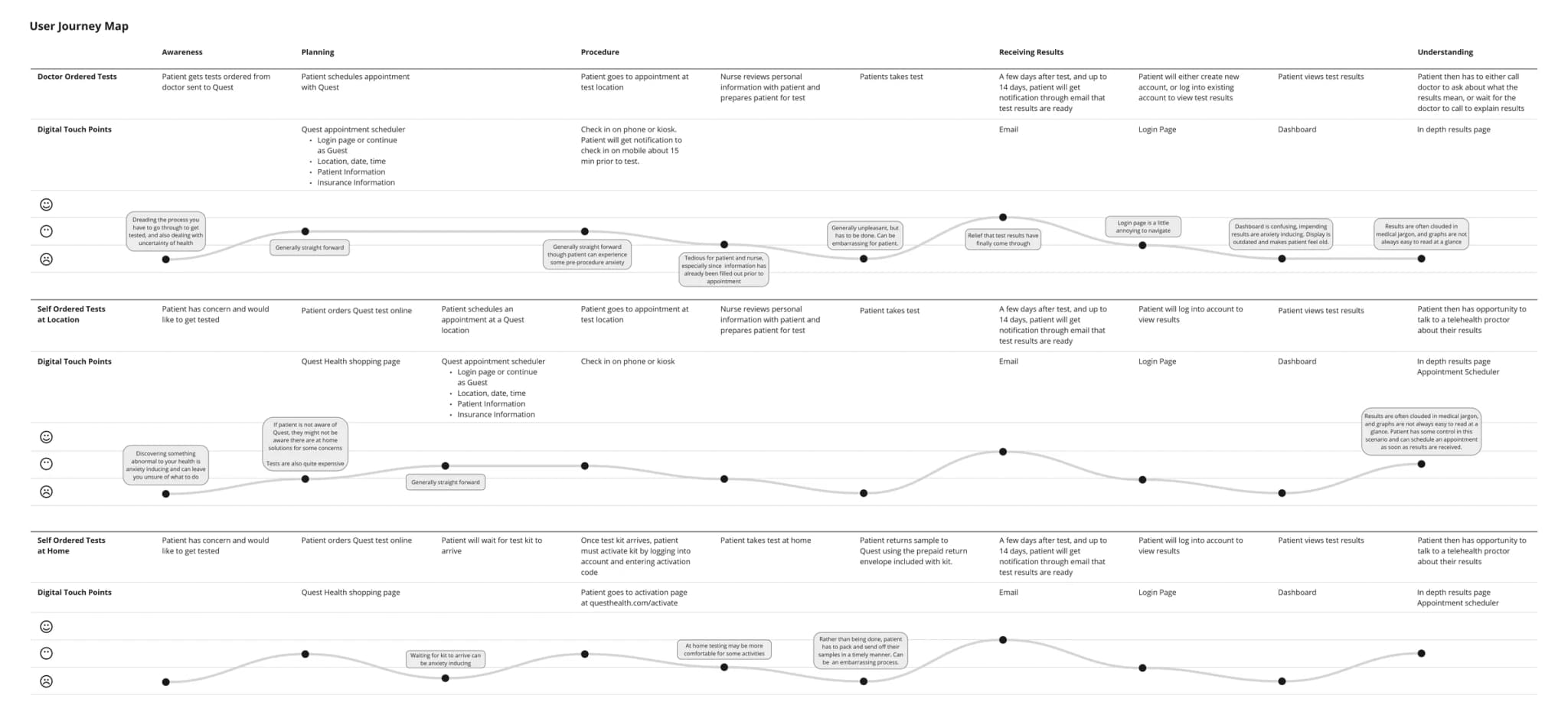
I interviewed three regular users to identify pain points in the testing process. Quest offers three main ways to order tests: through a doctor's appointment, online self-ordering with a clinic visit, or at-home test kits. Across all three, the same pattern showed up. The waiting is the worst part, and the results, once they arrive, are hard to read without a doctor on the phone.
Competitors
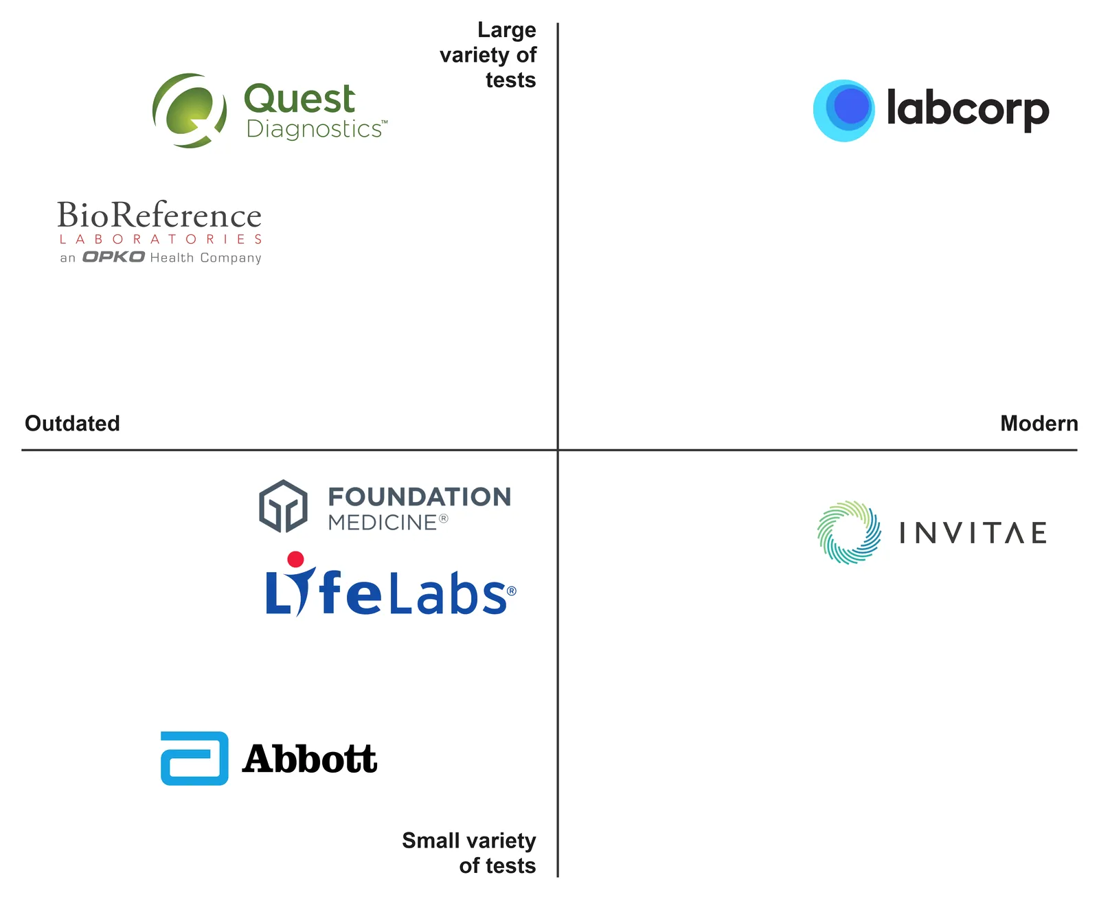
I mapped Quest against five competitors on test variety and how modern the experience feels. Labcorp was the one that was the most successful. They have the same services as Quest, but a much better website and brand. Quest's outdated look was both a problem and an opportunity.
Insights
From the research, I collected six major insights on what can be improved with Quest from a digital product perspective, each paired with a direction for the redesign.
General lack of awareness of at-home solutions, or of the ability to order a test without a doctor. Bring this to the patient's attention early and clearly.
Patients often wait for doctors to interpret test results because the data is hard to understand and next steps are unclear. Present test data clearly, and use AI to tailor that explanation to the patient.
The process involves a lot of waiting, which drives patient anxiety. Give patients a way to feel immediate control over their health.
Certain tests are uncomfortable when the patient isn't prepared. Prepare them adequately so they know what to expect.
Quest's history as an older diagnostics company means systems and designs that once sufficed are now inefficient for patients. Visual and technical modernization improves the experience and the company's image.
The current site repeats sections and elements within a single page. Simplify and organize with structure and hierarchy throughout.
Low fidelity prototype
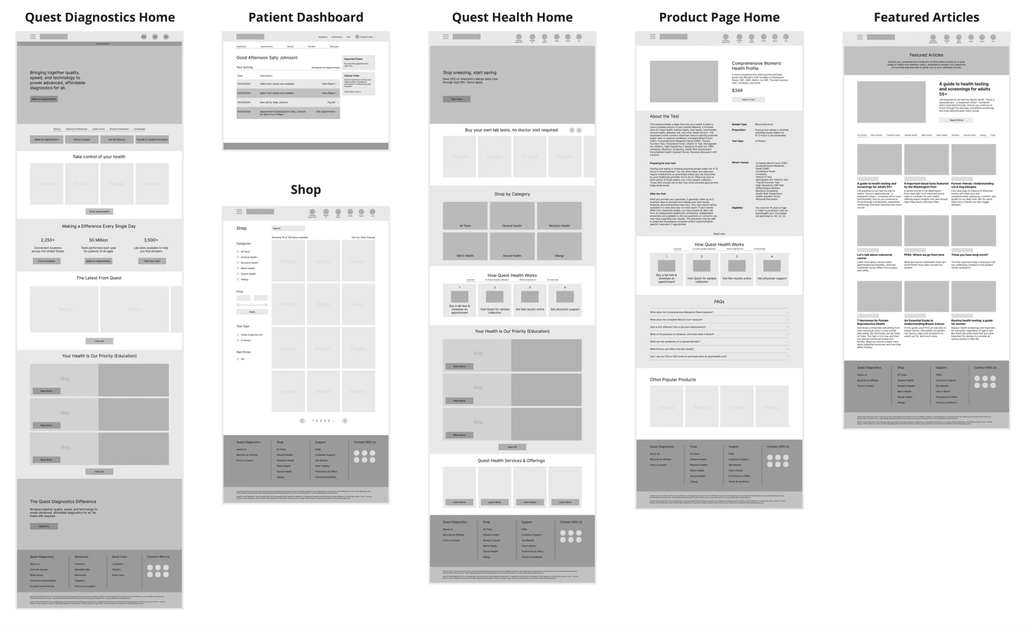
Using these insights, I built a low fidelity prototype to outline the new site.
Feedback
I put the prototypes in front of three design experts, and their feedback fell into three categories.
Give patient services their own page instead of burying them in menus.
Use AI to help patients figure out which test they need.
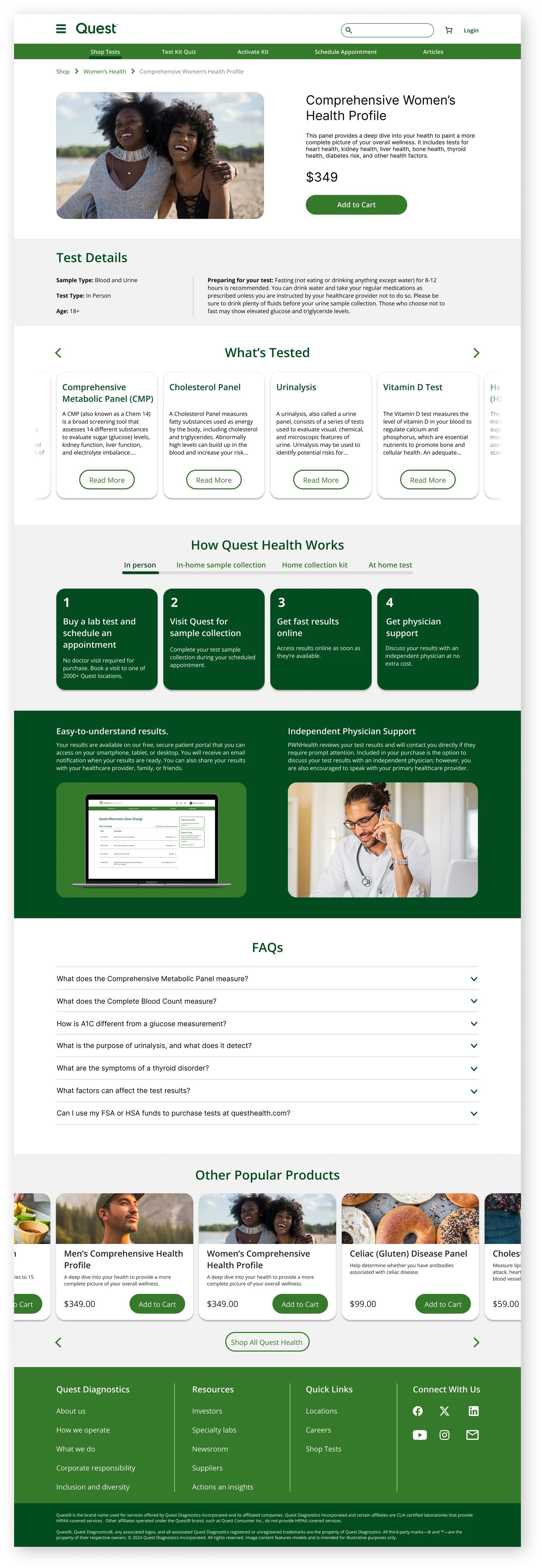
The product pages were too text heavy.
High fidelity prototype
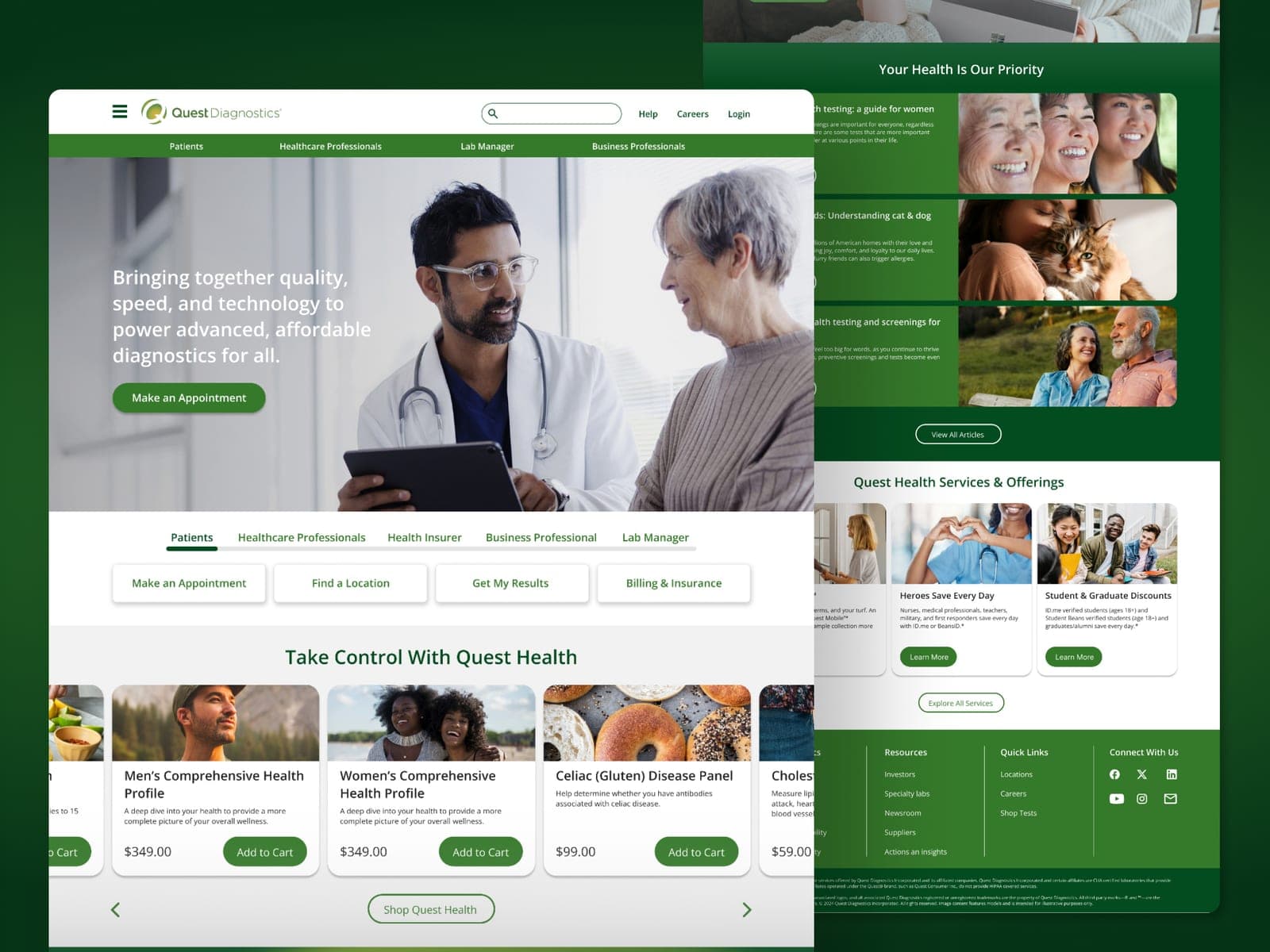
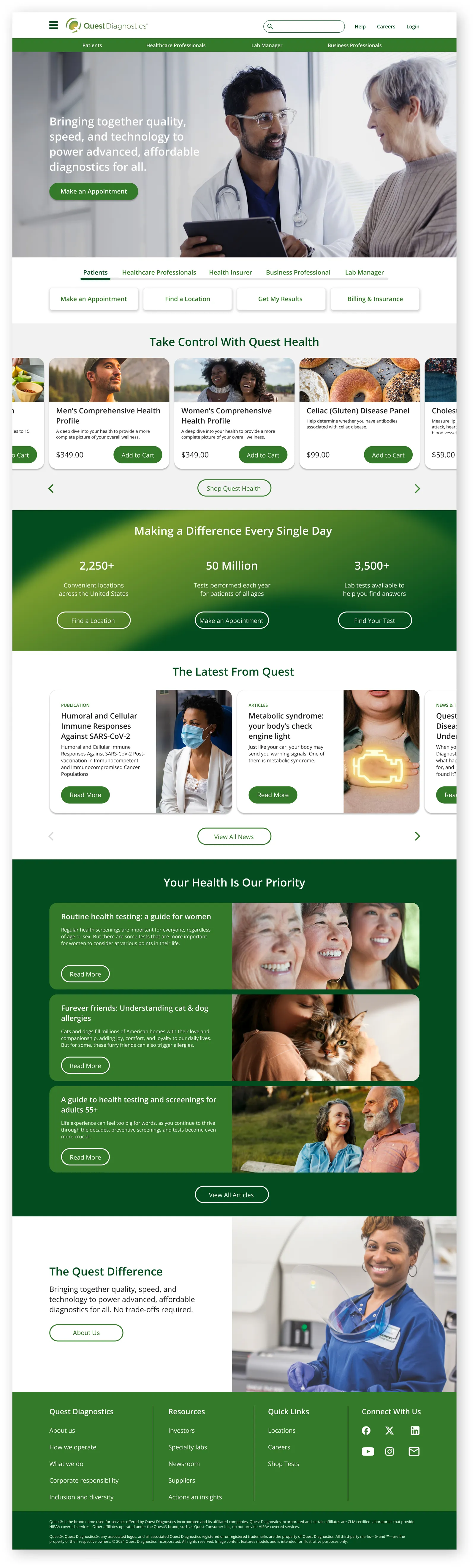
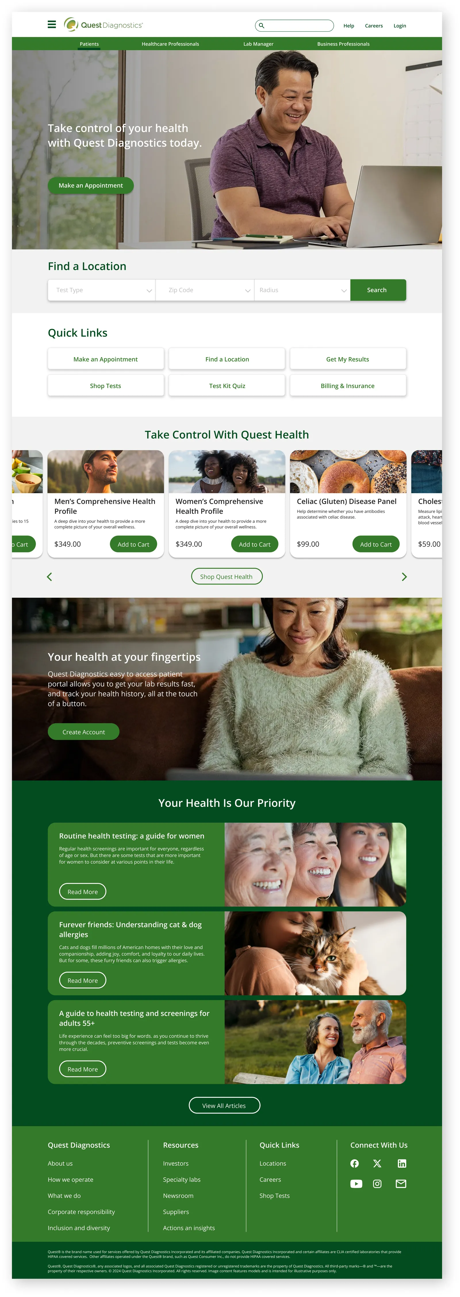
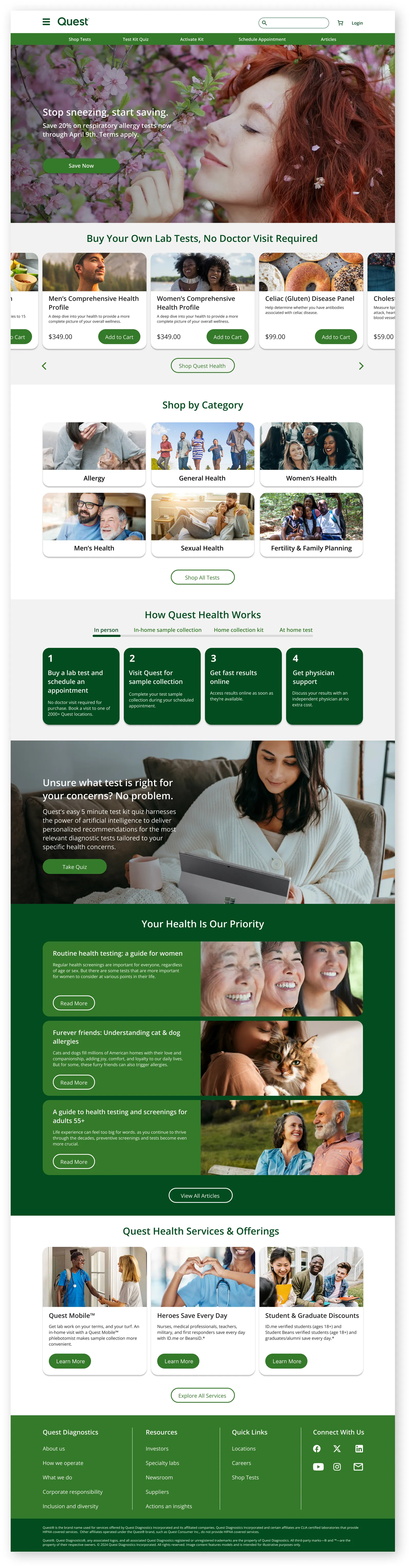
Each user type gets its own page, and Quest Health now shows above the fold. Brighter colors and refreshed images get rid of the dated feel.
Login and dashboard
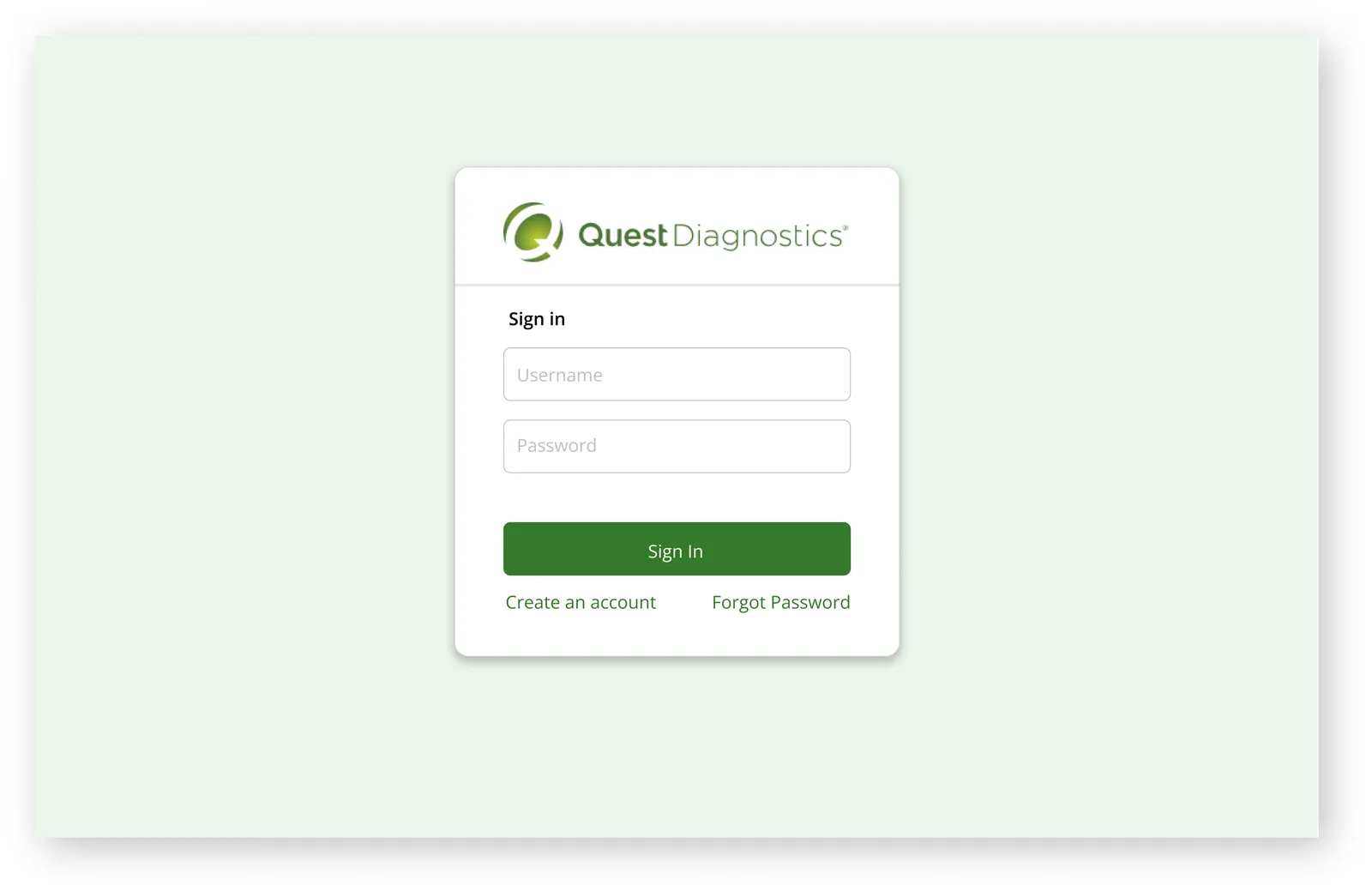
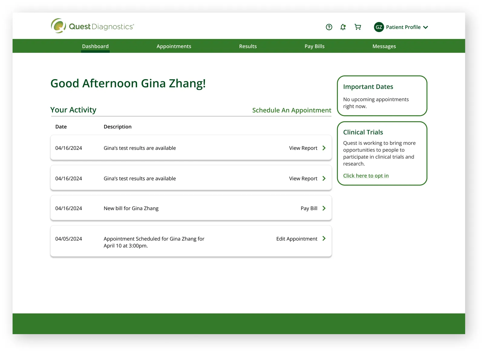
Login is easily accessible, the Dashboard has been modernized, and content has been streamlined to prioritize key information for patients. The top navigation is user-friendly and visually consistent with the rest of the site's navigation bars.
Test kit quiz
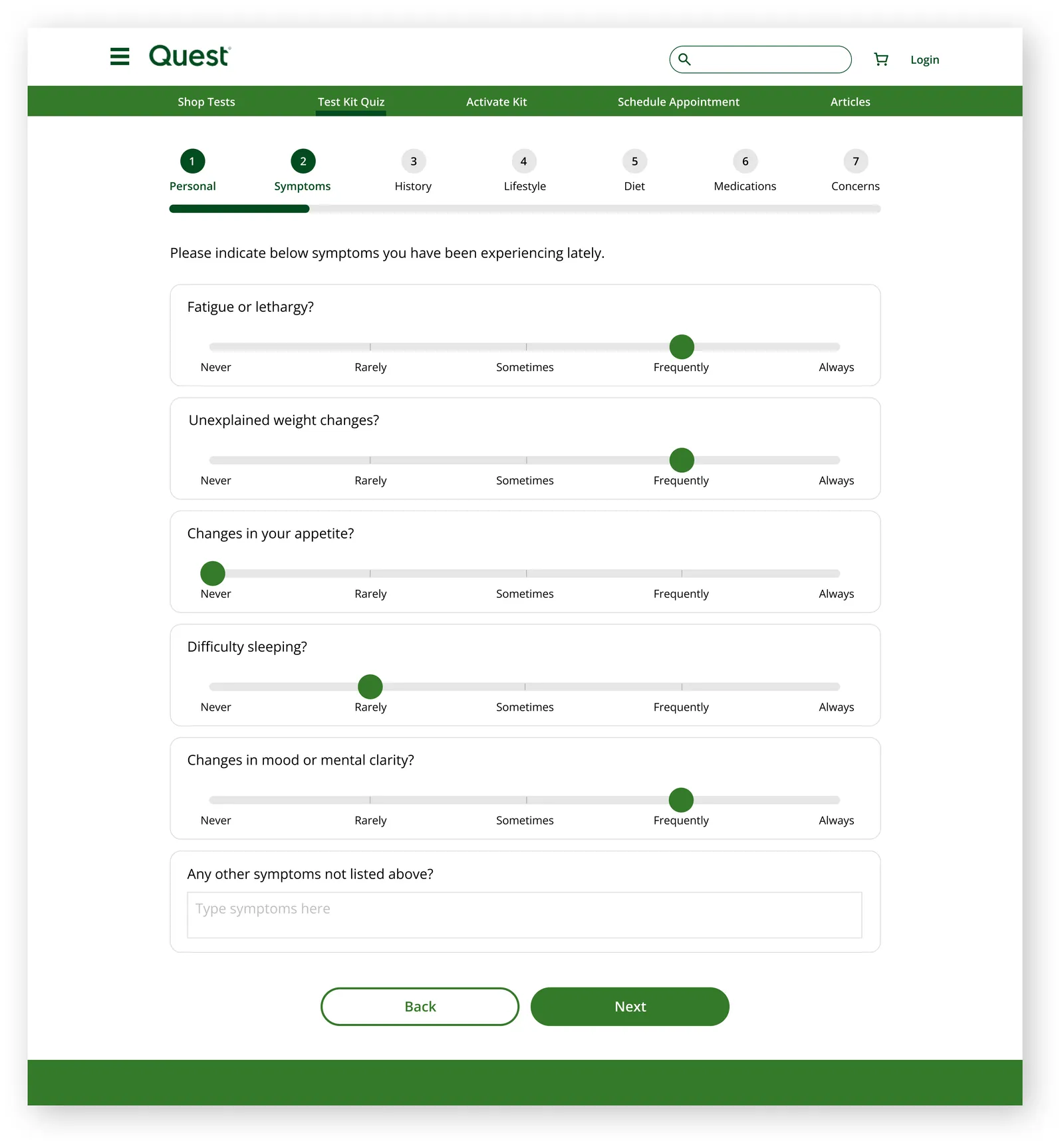
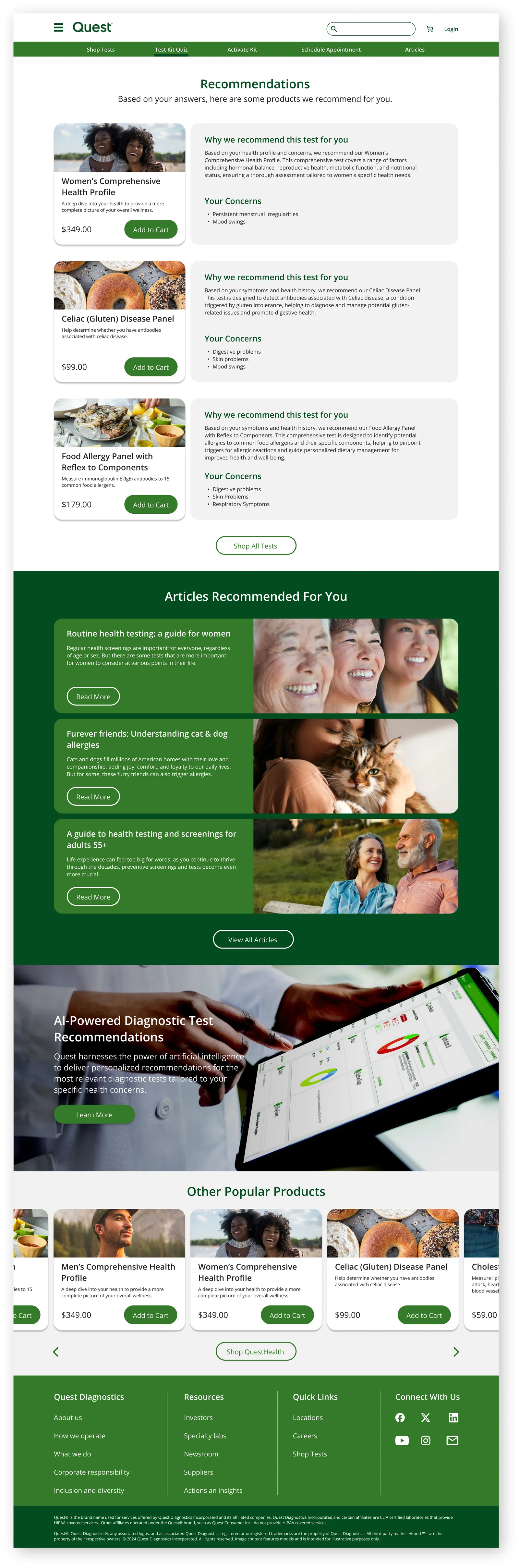
A significant challenge for patients ordering their own tests is uncertainty about which tests to choose. Leveraging AI tools, we can provide personalized recommendations to patients based on any personal concerns they have. With the power to process more ambiguous inputs effectively, we can offer tailored product recommendations for areas where patients may lack clarity.
Shop
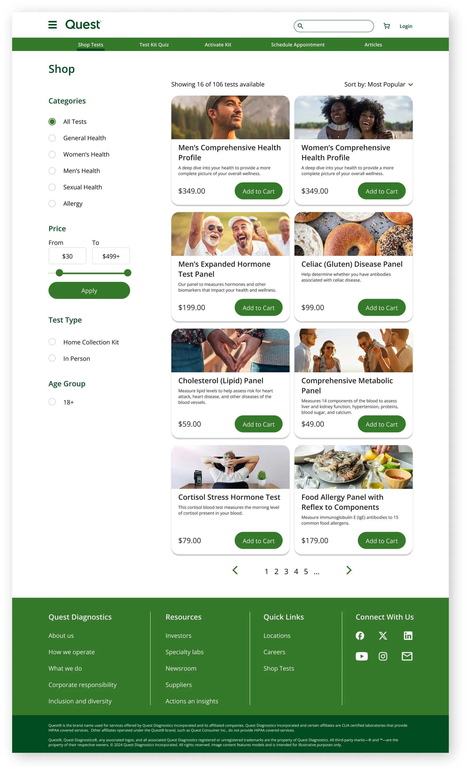
Product photos on every test, fewer filters, and product pages with fewer layers to click through.
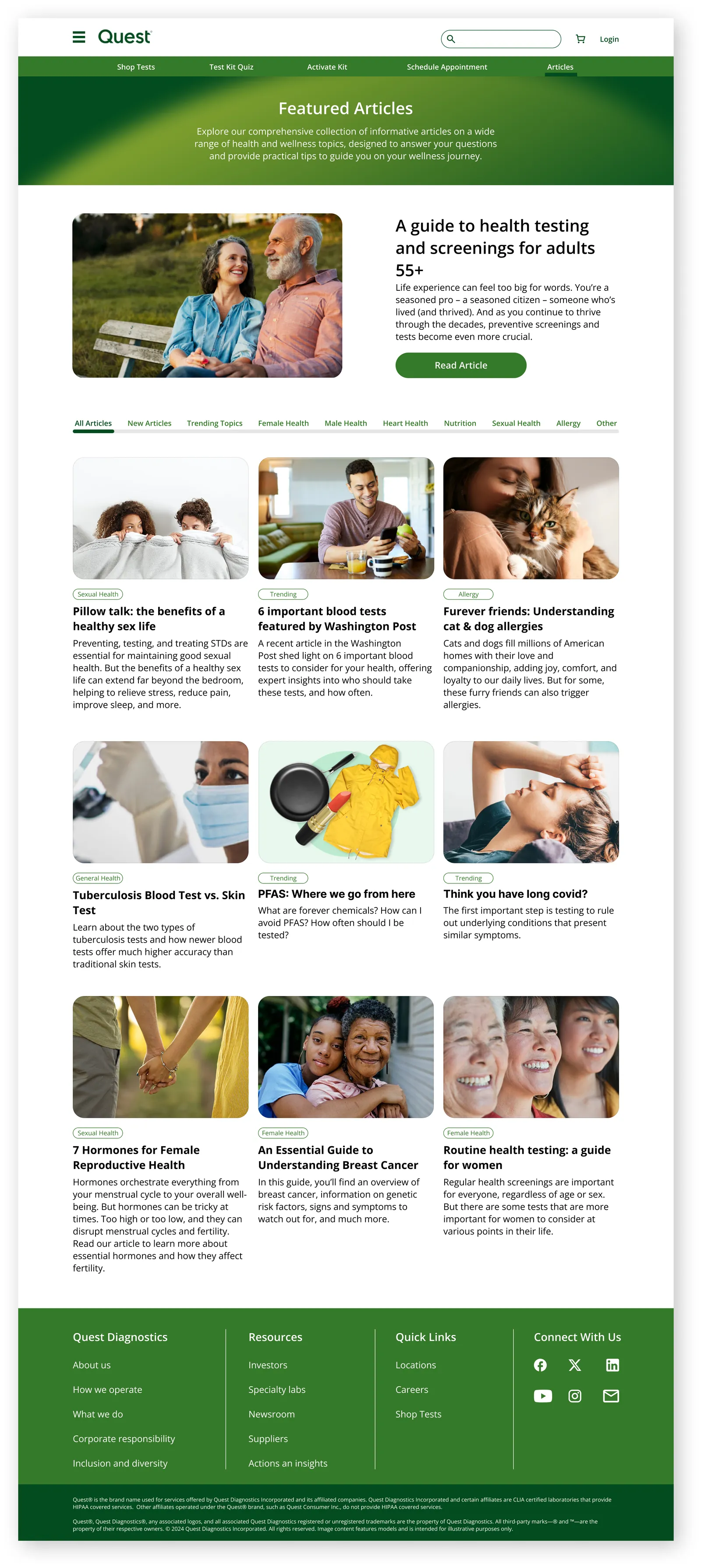
Articles
Articles are filterable by topic, newest first.
User feedback
I tested the high fidelity prototype with 8 users on a testing platform. I found that the shop needs another pass. Only 62.5% found the test kit catalog, and half failed to add a product to cart. If I picked this project back up, the shop and checkout flow is where I'd start.
Project takeaways
A collection of thoughts and challenges throughout the project.
While I primarily focused on the patient side of the Quest website, I noticed that Quest needs to make their website functional for at least five different users: Patients, Healthcare Professionals, Health Insurers, Business Professionals, and Lab Managers. Each user has their own unique set of needs and motivations when accessing the Quest platform, so design changes need to be considerate of all users.
After user testing, multiple people mentioned that the wording of certain questions initially confused them. This highlights the importance of precision in phrasing during user testing, as it can significantly impact the results.
AI can play a crucial role in helping create significantly more personalized recommendations efficiently and with greater accuracy.